Descriptive statistics summarize your dataset, painting a picture of its properties. These properties include various central tendency and variability measures, distribution properties, outlier detection, and other information. Unlike inferential statistics, descriptive statistics only describe your dataset’s characteristics and do not attempt to generalize from a sample to a population.
![]() Using a single function, Excel can calculate a set of descriptive statistics for your dataset. This post is an excellent introduction to interpreting descriptive statistics even if Excel isn’t your primary statistical software package.
Using a single function, Excel can calculate a set of descriptive statistics for your dataset. This post is an excellent introduction to interpreting descriptive statistics even if Excel isn’t your primary statistical software package.
In this post, I provide step-by-step instructions for using Excel to calculate descriptive statistics for your data. Importantly, I also show you how to interpret the results, determine which statistics are most applicable to your data, and help you navigate some of the lesser-known values.
Additionally, I include links to resources I’ve written that present clear explanations of relevant statistical concepts that you won’t find in Excel’s documentation. And, I use an example dataset for us to work through and interpret together!
Before proceeding, ensure that Excel’s Data Analysis ToolPak is installed. On the Data tab, look for Data Analysis, as shown below.

If you don’t see Data Analysis, install that ToolPak. Learn how to install it in my post about using Excel to perform t-tests. It’s free!
Descriptive Statistics in Excel
Let’s start with a caveat. Use descriptive statistics together with graphs. The statistical output contains numbers that describe the properties of your data. While they provide useful information, charts are often more intuitive. The best practice is to use graphs and statistical output together to maximize your understanding. At the end of this post, I display the histograms for the variables in this dataset.
For this example, we’ll assess two variables, the height and weight of preteen girls. I collected these data during a real experiment. To use this feature in Excel, arrange your data in columns or rows. I have my data in columns, as shown in the snippet below.

Download the Excel file that contains the data for this example: HeightWeight.
In Excel, click Data Analysis on the Data tab, as shown above. In the Data Analysis popup, choose Descriptive Statistics, and then follow the steps below.

Step-by-Step Instructions for Filling in Excel’s Descriptive Statistics Box
- Under Input Range, select the range for the variables that you want to analyze. You can include multiple variables as long as they form a contiguous block. While you can explore more than one variable, the analysis assesses each variable in a univariate manner (i.e., no correlation).
- In Grouped By, choose how your variables are organized. I always include one variable per column as this format is standard across software. Alternatively, you can include one variable per row.
- Check the Labels in first row checkbox if you have meaningful variable names in row 1. This option makes the output easier to interpret.
- In Output options, choose where you want Excel to display the results.
- Check the Summary statistics box to display most of the descriptive statistics (central tendency, dispersion, distribution properties, sum, and count).
- Check the Confidence Level for Mean box to display a confidence interval for the mean. Enter the confidence level. 95% is usually a good value. For more information about confidence levels, read my post about confidence intervals.
- Check Kth Largest and Kth Smallest to display a high and low value. If you enter 1, Excel displays the highest and lowest values. If you enter 2, it shows the 2nd highest and lowest values. Etc.
- Click OK.
For our example dataset, fill in the dialog box as shown below.

Interpreting Excel’s Descriptive Statistics Results
After Excel creates the statistical output, I autofit the columns for clarity.

As you can see, we’re assessing two variables, height in meters and weight in kilograms.
Generally, we’ll work our way down from the top of Excel’s descriptive statistics output. However, I’ll group the results into categories that make sense. Consequently, the following discussion doesn’t strictly follow the order of the output. If you want to learn more about the statistics, be sure to click the links for more detailed information!
Central Tendencies (Mean, Median, Mode)
A measure of central tendency describes where most of the values in the dataset occur. It’s the center of the distribution of values. Excel presents three measures of central tendency. Which one is best for your data?
- Mean: This measure is the one with which you’re most familiar. It’s the sum of all observations divided by the number of observations. It’s best for data that follow symmetric distributions.
- Median: This value splits your data in half. Half the values fall above the median while half are below it. It’s best for skewed distributions.
- Mode: This measure represents the value that occurs most frequently in your data. It’s best for categorical and ordinal data.
The example data are continuous variables. Excel frequently displays “N/A” for the mode when you have continuous data. That happens because continuous data are unlikely to have exactly duplicated values, a requirement for the mode. Thanks to a data collection artifact, my data are continuous, but Excel displays the mode anyway. The study’s nurse collected the underlying data in inches and pounds, rounded them to the nearest unit, and converted them to their metric equivalents. That process produced clumps of rounded values. However, the mode really is not a good measure for these data.
Related post: Data Types and How to Graph Them
Central Tendency for our Descriptive Statistics Example
What can we learn by comparing the mean and median for both variables? For the height data, they are virtually equal, 1.51m and 1.50m, respectively. For symmetric distributions, the mean and median will be very close together. That’s a good sign that the heights follow a symmetric distribution, making the mean a good choice. The mean tells us that the height distribution centers on 1.51m.
However, there is a difference between the weight mean (46.3kg) and median (44.9kg). When the mean is greater than the median, it indicates that the distribution is right-skewed. We should use the median for these data. Half the data points fall above 44.9kg, and half fall below.
For more information about the different measures of central tendency, their calculations, how data types and distribution properties affect them, graphical representations, and when to use each type, read my post about Measures of Central Tendency.
Measures of Dispersion (Standard Deviation, Variance, Range)
Previously, you saw how a measure of central tendency indicates where most observations fall. Measures of dispersion indicate how closely clustered or loosely spread the data points fall around the center. Excel presents three measures of dispersion. In general, as their values increase, data points spread out further from the center (i.e., the distribution becomes broader).
- Standard Deviation: The standard or typical difference between each data point and the mean. This measure uses the original units of the data, simplifying interpretation. Hence, analysts use this measure of variability the most frequently. The standard deviation is the square root of the variance.
- Variance: The average squared difference of the values from the mean. Because the calculations use squared differences, the variance is in squared units rather than the original data units. While higher values of the variance indicate greater variability, there is no intuitive interpretation for specific values. Read more about the variance.
- Range: The difference between the largest and smallest values in a dataset. The range is easy to understand but it is based on only the two most extreme values in the dataset, making it very susceptible to outliers. Additionally, the size of the dataset affects the range. As the sample size increases, the range tends to expand. Consequently, use the range to compare variability only when the sample sizes are similar. Read more about the range.
Typically, use the standard deviation. When you have fairly skewed data, consider using the interquartile range (IQR), which Excel doesn’t provide, unfortunately.
Variability for our Descriptive Statistics Example
For the height data, the standard deviation is 0.07m (7cm). The typical height falls 7cm from the mean of 1.51m. The range tells us that the spread from the tallest to the shortest is 0.33m (33cm). You can draw similar conclusions from the weight data.
It might be tempting to compare the variability between heights and weights using the standard deviations. However, their standard deviations use different units, M and kg, making a direct comparison impossible. However, for some data, you can compare their coefficients of variation, which is easy to calculate using the standard deviation and means. For more information, read my post about the coefficient of variation.
For more information about the different measures of variability, their calculations, and when to use each type, read my post about Measures of Variability.
Distribution Shape Properties: Kurtosis and Skewness
Kurtosis and skewness are two measures that help you understand the general properties of your data’s distribution. These measures compare your distribution’s shape to a symmetric distribution and the normal distribution.
When either kurtosis or skewness significantly deviate from zero, it might indicate that your data do not follow a normal distribution. However, use a normality test or a normal distribution plot to make that determination.
I find that histograms present the same information more intuitively. However, graph axes and bin sizes can be manipulated to exaggerate or deemphasize characteristics while these statistics are completely objective.
Related posts: Using Histograms to Understand Your Data and Manually Adjusting Your Graph Axes
Kurtosis
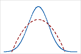
Kurtosis indicates how the peaks and tails of your distribution compare to the normal distribution. Is the peak taller or shorter than the normal distribution? Are the tails thicker or thinner? In the table, the red distributions have positive and negative kurtosis values while the blue distributions have a zero kurtosis value for comparison. For more details about this statistic, read my post about Kurtosis.
| Kurtosis value | Indicates | Graph |
| Zero | Consistent with a normal distribution |  |
| Positive |
Thicker tails than the normal distribution |
 |
| Negative |
Thinner tails than the normal distribution |
 |
For our example data, height has a kurtosis of -0.35. This value is close to zero, indicating that the tails are consistent with the normal distribution. However, weight has a kurtosis of 1.15, suggesting the tails are thicker than the normal distribution.
Skewness
Skewness indicates the symmetry of your data’s distribution. Skewed data are asymmetric. The terms right-skewed and left-skewed indicate the direction in which the long tail points on a distribution curve. Learn more about skewed distributions.
| Skewness value | Indicates | Graph |
| Zero | A perfectly symmetric distribution |  |
| Positive | Right-skewed data |  |
| Negative | Left-skewed data |  |
Note that a U-shaped distribution can be symmetric even though it is inverted compared to the normal distribution.
For our example data, height has a skewness of 0.11. This value is close to zero, signifying that these data have a symmetric distribution. However, weight has a skewness of 1.05, which indicates it is right-skewed.
The relative locations of the mean and median and these distribution properties paint a consistent picture of these two variables. For the height data, the mean and median are nearly equal, and kurtosis and skewness are both virtually zero. These measures collectively imply that the heights follow a symmetric distribution consistent with the normal distribution.
Conversely, the weight data have a mean that is higher than the median, a positive skew value, and a positive kurtosis value. These values suggest that the weights follow an asymmetric, right-skewed distribution that is not consistent with the normal distribution.
Minimum and Maximum
The minimum and maximum values in your dataset can help you understand where your data fall. For our example data, the heights fall between 1.33 – 1.66 M, while the weights fall between 29.26 – 80.74 kg. Additionally, these values can help you identify outliers. Frequently, data entry errors create values that fall outside the range of valid data. Look at the minimum and maximum values and see if they make sense for your data!
Related post: Five Ways to Find Outliers in Your Data
Sum and Count
The sum is simply the sum of all values for each variable. I’ve never found this to be helpful, but perhaps it will be for you. The count is the number of observations for each variable. Use this value to determine whether the sample size is what you expected. Both the height and weight variables have 88 observations.
Precision of the Mean: Standard Error and the Confidence Interval
The standard error and the confidence interval assess how precisely your sample mean estimates the population mean. A relatively precise estimate indicates that your sample estimate is likely to be close to the actual population value. Conversely, an imprecise estimate tends to be further away from the correct population value.
Technically, neither of the values belong in the descriptive statistics output because they use your sample data to infer the properties of a larger population (inferential statistics). Descriptive statistics only describes your data without considering a population. However, Excel includes them in the output, so I’ll interpret them here.
Be aware that inferential statistics impose additional requirements on data collection methodologies that do not apply to descriptive statistics. For example, you must use a representative sampling methodology, such as random sampling; otherwise, these measures are invalid.
For more information, read my post about the differences between descriptive and inferential statistics.
Standard Error of the Mean
The standard error of the mean is the standard deviation of the sampling distribution of the mean. What?!
If you took many samples from the same population and calculated each sample’s mean, you’d produce a distribution of sample means. That distribution has a standard deviation, which is the standard error of the mean.
Smaller standard errors indicate that your sample provides a more precise estimate of the population value. Unfortunately, there is no intuitive interpretation of these values. However, the calculations for confidence intervals (CIs) incorporate the standard error, and CIs are much easier to interpret. So, focus on the CIs and don’t worry about the standard errors!
Related post: Standard Error of the Mean
Confidence Interval (CI) of the Mean
A confidence interval of the mean is a range of values that a population mean is likely to fall within. Because of random sampling error, you know that your sample mean is unlikely to equal the population mean, but how large is that difference? CIs help you answer that question by providing a range of probable values for the population mean.
Narrow CIs indicate more precise estimates of the population mean. In other words, you can expect your sample mean to be relatively close to the population mean.
Excel doesn’t provide the range, but it does display the number to add and subtract from your mean to calculate the confidence interval.
For the height data, Excel displays 0.015530282, which I’m rounding to 0.02. To calculate the CI, take the average height and +/- this value. In other words, 1.51 +/- 0.02 creates a CI of 1.49 – 1.53. We can be confident that the mean height for this population falls between these two values.
Using the same process, the confidence interval for weight is [43.98 48.68]. We can be confident that the mean weight for the population falls between these values.
If you want to know more about standard errors, confidence intervals, and confidence levels, read my post about How Confidence Intervals Work.
Histograms of our Descriptive Statistics Data
Let’s see the histograms for our example data. These graphs are not a part of Excel’s descriptive statistics. However, my suggestion is that you graph your data first and then study the numbers. All the statistics in this post describe the data that created the graphs below.
Are there any surprises?


For myself, I expected the height data to be more perfectly symmetrical. However, they are very slightly skewed to the right. The weight data are more right skewed, consistent with the descriptive statistics.
While the Descriptive Statistics analysis can’t assess correlation, read my post about Using Excel to Calculate Correlation to evaluate the relationship between these two variables!
Hi Jim, thanks for the great site! You say that a positive Kurtosis value means thicker tails and a negative value means thinner tails. Isn’t that the wrong way round? My understanding is that a positive value means a taller peak, which presumably always means thinner tails?
Hi Lee,
That’s a great question.
Kurtosis is often associated with the shape of the peak, but it’s really a measure of the tails—specifically, how likely a distribution is to produce extreme values. A positive kurtosis value means heavier tails than a normal distribution (produces extreme values more often), and often—but not always—a sharper peak. A negative kurtosis value means lighter tails (produces extreme values less often) and usually a flatter peak. So while the peak can be part of the picture, kurtosis is fundamentally about the tails.
Many people understandably focus on the peak because it’s visually striking and easier to describe. But statistically, kurtosis is more directly about the tails—specifically, how much probability mass is in the extreme ends of the distribution compared to the center.
The confusion often comes from textbook diagrams of high-kurtosis distributions showing sharp peaks, which makes it easy to assume that’s what kurtosis measures. In reality, the mathematics of kurtosis emphasizes the contribution of outliers and tail heaviness.
I find very helpful to do my practical assignment.
I love your books and blogs. I am a layman when it comes to statistics. I like to use Excel to analyze interesting pursuits like the effectiveness of our community’s cane toad removal efforts and my efforts to improve air gun target shooting. Quick question: Can Excel produce the “predicted R-squared” you describe to determine overfitting? I don’t see it; just the “adjusted R-squared” to evaluate when too many independent variables are being used. If it doesn’t offer “predicted R-squared” directly, are there formulas I can use to calculate it?
Hi Richard,
I love how statistics are usable in so many situations. It’s fantastic you’ve found ways in your personal life and community!
Unfortunately, I don’t believe that Excel can calculate predicted R-square as a built-in function. There are some 3rd party Excel add-ons that might be able to calculate it. I’m not sure. You could probably create an Excel formula yourself to find the answer. I might take a stab at that some point, but my to do list is a bit long!
I’m sorry I didn’t have a better answer for you!
Thank you Jim! I don’t know if my question is appropriate to this post, so please disregard if thats the case. I used an online calculator to find a sample size, with a 95% confidence level and 5% confidence interval. Now I collected the data and have my sample mean, and would like to report it estimating what the population mean would probably be like. And I don’t know if I should calculate de confidence interval using the 5% that I used in the sample size calculation (mean +/- 5% of the mean), or if I should use the number reported by Excel to calculate the 95% confidence interval, which you discuss in your post (mean +/- number reported by Excel).
Thank you again.
Hi Aline,
I’m not sure what you mean when you say you looked up both a 95% confidence level and a 5% confidence interval. Do you mean a 95% confidence level and a 5% significance level? Those are two different forms of the same things and those values fit together. The significance level = 1 – confidence level. So, if you use a confidence level of 95%, that corresponds to a significance level of 5% in a hypothesis test.
So, I’m not entirely sure what you mean there.
However, in terms of reporting for the confidence interval specifically, you report the confidence level, which is almost always 95%. Here is how the APA says you should report CIs. From their manual,
“Use the format 95% CI [LL, UL] where LL is the lower limit of the confidence interval and UL is the upper limit. For example, one might report: 95% CI [5.62, 8.31].”
Even if you’re not required to use the APA format, you’ll be on solid ground by using it. Depending on the knowledge of your audience, you could follow that up with a fleshed-out interpretation, such as the following for the APA’s example:
The results indicate there is a 95% confidence level that the population mean falls between 5.62 and 8.31.
I hope that answers your questions!
Hello Jim,
Thank you for this post! I have a question about the Confidence Interval (95%) number that excel provides. Is it just applicable to estimate the population mean? I am wondering how to provide a confidence interval for proportions observed in the sample, for example the number of cases that are within a certain height range (to use your example) so that we can generalize the results to the population. I wanted to know which confidence interval to use if I wanted to report that we are 95% certain that (roughtly) 35% (+/- confidence interval number) of the population’s height will be between 1.45-1.51 (looking at the distribution of your histogram above). Will this be a different CI – perhaps what is used to calculate the sample size?
Hi Aline,
Confidence intervals are only applicable to inferential statistics. Inferential statistics are when you use a sample to generalize to a population. In other words, you’re using sample characteristics to infer the properties of a population. As I mention in this post, it’s not accurate for Excel to include CIs in their descriptive statistics, which adds to the confusion! Inferential statistics need to account for the sampling error, which is the difference between your sample and the population. CIs are one way of doing that. So, if you want to generalize to a population, then you’re performing inferential statistics and CIs are appropriate.
Descriptive statistics is when you’re just describing the sample that you measured. There’s no uncertainty because you’ve measured everyone in the sample. Hence, there’s no reason at all to use a CI or hypothesis testing. You know the sample exactly. So, if you are not generalizing to a population and just want to understand the sample itself, don’t use CIs.
There are confidence intervals for population parameters other than the mean. You can obtain them for proportions, standard deviations, and so on. They just involve different calculations and data types. For proportions, you need binary data. For example, if you had pass/fail data, those are binary. You could collect a random sample and calculation the proportion of those who passed out of the total number. Additionally, you could obtain a CI for the proportion which gives you a range of likely values for the population proportion. In this example, you are again generalizing from the sample to the population. Hence, CIs are appropriate.
You could convert the continuous height data to binary data. For example, all heights greater than X could be considered “tall” while all heights lower than X are “not tall.” You’d have binary data with the two possible values of tall/not-tall. You could then calculate a proportion for those who are tall and get a CI for that proportion.
I hope that answers your questions!
Thank you, Jim! In my first semester of a doctoral program, and it has been 20+ years since I was in a stats class. I recommended that my professor link to your blog because it is very helpful for our intro course and a good companion to the textbook. I have this bookmarked for the future.
or in simple terms I want to ask what is the difference between SE= SD/sqrt N and SE(m)= Sqrt (2MSE/r)…and what they both interpret.
Thank you sir!
I read your recommended post and SEM post also, again very nicely explained.
I could now understand the line:
“The standard deviation is the variability of individual data points around the sample mean. The standard error of the mean is the variability of sample means in the sampling distribution of means.”
But again my question is standard error of the mean is given in the end of the ANOVA and I can understand that it is a kind of variability measures for the different sample means in the sampling distribution and is used for further calculations.
but what about the standard error of the sample mean (individual sample only)……
many research articles have mentioned the SE for individual sample means and also for which we can also go for the standard deviation….. in spss descriptive statistics both SD and SE are given for individual sample means.
after calculations I find this SE of sampling mean given there = SD for the sample mean/sqrt of number of replications or individual units in that sample……which is similar to SEM formula where formula is SD/sqrt Number of samples.
so my quarry is what does this SE for sample mean indicates.
Hi Himanshu,
I *think* I see where some of your confusion is but I’m not sure.
Let me clarify. You’re seeing the standard error of the mean in an ANOVA context and you’re thinking it applies to the multiple means that you’re analyzing? If so, that’s not correct, although I can see how that would seem to make sense in that context! The F-test itself assesses the variability of the group means. To read how that works, read my post about the F-test in ANOVA. That does involve assessing both the variability of the group means and data points around their mean.
However, that is different from my discussion about the standard error of the mean. These standard errors are for individual sample means. Although you can have them for the group means in ANOVA too. But, in my post about the standard error of the mean, I’m talking about them from the standpoint of an individual sample. The distribution of means I’m referring to in that context is the sampling distribution (not the multiple means in ANOVA). You can have only one sample mean but the procedure still estimates a sampling distribution.
So, while reading my post about the standard error of the mean, keep in mind that I AM referring to individual sample means–exactly what you’re asking about! I hope that will clarify that aspect for you.
Yes, the standard error for an individual sample mean is the standard deviation/square root of the sample size. Again, that formula is in my other post.
I’m not familiar with SE(m)= Sqrt (2MSE/r). I don’t have SPSS so I’m not sure what that is in relation to. Sorry.
If I’m misunderstanding what you’re unsure about, please clarify!
Hi Jim,
When we talk about skewness , we talk about right tail and left tail(we divide distribution in two parts). if right tail is long then we say right skewed else left skewed.
in case of unimodal data , we divide distribution in two parts by looking at peak. right side of peak will be considered as right tail and left side of peak will be considered as left tail. so here, mode is point which divide distribution in two parts.
but in case of bimodal data , if we divide two parts using either of mode then it will not look symmetric even though my distribution can be symmetrical if i use other point like median to divide my distribution in two parts.
so , i am getting confused that am i interpreting rightly that in case of unimodal we divide distribution by looking at peak (mode) and then compare two parts to get idea of skewness or is there any other technique which we use to divide distribution in two parts?
Thanks…
Respected Sir
Greetings
any reply to this comment please
Stay Safe
Best wishes
Hi Himanshu,
Somehow your previous question slipped through the cracks! I’ll be answering momentarily!
Hello sir
Greetings of the day
Here I am with one more quarry regarding the descriptive statistics.
1. Sir What is the difference between the Standard deviation (SD) and Standard Error (SE).
Suppose we have given 3 treatments to a population with 5 Replication each.
As of now what I have understood is :
a.) we calculate SD for each treatment mean and write mean of 5 replication in a given respective treatment +- SD of respective treatment in the table
b.) SE or SEM is calculated in ANOVA when it is performed for all the treatment and is used for the calculation of LSD.
But in many research papers they use to mention mean +- SE in many places with the treatment mean instead of SD. Also in SPSS, the descriptive statistics provide both SD and SE for the treatment.
So my question is how SE is calculated for treatment instead of whole of the population (different treatment in ANOVA as point b).
2. In excel 2016 there are two formulas given STDEV-S and STDEV-P which I think is STDEV -S is for sample and is actually SD and STDEV-P is for population is actually SE,
Sample means each treatment (only 5 replications) and population means all the treatments (all the 3 treatments along with their respective 5 replication) in combination (population comprises all the treatments which we have given to the population)
Am I correct or not for the point 2?
Thank you and Regards
Hi Himanshu,
The standard deviation is the variability of individual data points around the sample mean. The standard error of the mean is the variability of sample means in the sampling distribution of means. Specifically, if the standard error of the means is the standard deviation of the sampling distribution. Conversely, the standard deviation applies to the distribution of sample values.
Statistical procedures use the standard error of the mean to calculate p-values and confidence intervals. Typically, you don’t interpret them directly. It assess how precise your sample mean estimates the population mean.
There are different equations for the standard deviation depending on whether you’re using a sample to estimate a population (use STDEV -S) or whether you just want to know the standard deviation for a particular dataset and not use it to infer the properties of a larger population (use STDEV -P). For more information on that issue and the nature of the difference between the two formulas, read my post about Measures of Variability, which discusses all that. Note that STDEV -P is NOT the standard error.
So, you have three different calculation methods, standard deviations for a sample or a population (click link above), and the standard error of the mean, which is the sample standard deviation divided by the square root of the sample size.
I hope that helps!
Do you have instructions on how to make graphs in excell?
Hi,
I currently don’t have posts about how to make graphs in Excel. However, I am expanding my Excel content all the time and will eventually explain how to create and interpret graphs in Excel. Was there a particular graph you’re interested in?
Hola Jim, te leemos desde muchas partes del mundo; gracias por compartir tus conocimientos.
Saludos desde Colombia!
Thanks! Very helpful – like the book I bought from you!
Thank you, Dr. Muller! I’m also so glad to hear that my book was helpful! 🙂
greatly appreciated..thank you very much..this is really helpful.
Hi Jim, There some errors in stating kurtosis for skewness and vice vera.
Thank you Bal Ram! I’ve fixed that typo!
Your Descriptive Statistics in Excel manual is very good and applicable to my veterinary and agronomy students. For your information I bought your books Regression Analysis and Hypothesis Testing by Amazon. Greetings from Brazil.
Thanks a bunch Jim. You have always done it well. Quite appreciate.
Someone mentioned that you did a book on Minitab. Which book is that? I will like to have it since I have a Minitab but most lessons are either on SPSS or XLSTAT
Hi Elijah,
I have three books and all three use Minitab. In these books, I don’t teach the use of Minitab but I use it to perform the analyses, create the output and graphs, etc. My goal is that everyone can learn from them even if they don’t use Minitab. However, if you use Minitab, I’m sure you’ll get a little bit more!
To see my books, go to my webstore. My books are listed there and you can even get free samples of them, so you can get an idea of what they cover and how I use Minitab. I include a note about my usage of Minitab at the end of the Introduction section in each book.
Happy reading!
Jim
Thank you so much Jim for the simplicity in your explanations and support towards our research problems. Stay blessed
Hi Sulaina! I’m so glad it was helpful! You stay blessed as well! 🙂
I was looking for clear cut explanation of descriptive stats in excel and you explained with utmost clarity. Thanks a ton!
You bet, Dhawal! So glad it was helpful!
Thank you so much for your elaborate exposition. This is very enlightening. You make statistics really enjoyable & functional in research
Excellent !! Jim !!! Thank you so much
You’re very welcome, Janardhan!
Appreciated Jim. I bought your books but found the books are using Minitab. Can you create a version of your book using Excel. I understand Excel doesn’t have all of the capabilities of Minitab, but can you cover the topics that Excel is capable of, without using VBA?
Hi Denny,
Yes! My plan is to write a book that focuses on using Excel to perform statistical analysis.
Always very helpful! Appreciated Jim! Very clearly explained
Thanks, Bob!! 🙂