Use an empirical cumulative distribution function plot to display the data points in your sample from lowest to highest against their percentiles. These graphs require continuous variables and allow you to derive percentiles and other distribution properties. This function is also known as the empirical CDF or ECDF.
 If you measure the same characteristic in multiple samples, you can use empirical CDF plots to compare the sample distributions.
Optionally, your software can display the fitted cumulative distribution function so you can compare how well the empirical distribution follows the fitted distribution. The fitted distribution uses parameters estimated from your data. Unlike a Q-Q plot, your statistical software does not transform the axes to create a straight line for a cumulative distribution function. Learn more about these Fitted Cumulative Distribution Functions.
Use an empirical CDF plot to assess the following features of your dataset:
- Percentiles and proportions for data ranges.
- Identify where most values occur.
- Assess the range of your data.
- Compare sample distributions.
- Determine how well your data follow a fitted distribution.
The empirical CDF is a step function that asymptotically approaches 0 and 1 on the vertical Y-axis. It’s empirical because it represents your observed values and the corresponding data percentiles. The step function increases by a percentage equal to 1/N for each observation in your dataset of N observations.
At a minimum, empirical CDF plots require one continuous variable. To learn about other graphs, read my Guide to Data Types and How to Graph Them.
Related post: Percentiles: Interpretations and Calculations
Example Empirical CDF Plot
A manufacturer measures the strength of a random sample of aluminum castings.

The blue stepped line is the empirical CDF function and the red curve is the fitted CDF for the normal distribution.
Empirical CDF plots typically contain the following elements:
- Y-axis representing a percentile scale.
- X-axis representing the data values.
- Stepped function displaying the cumulative distribution observed in the sample.
- Optionally, statistical software can display a fitted cumulative distribution based on parameters estimated from the sample.
Continue reading to learn how to obtain more information from this graph!
Interpreting Empirical CDF Plots to Assess Distributions
Data Range
To determine the range of the data, look for the first and last steps in the step function.
For the aluminum casting data, strength values range from about 0.3 (the first step) to approximately 1.2 (the last step).
Related post: Measures of Variability
Most Common Values
To determine where the most common values occur, look for the steeper portions of the step function. Conversely, flatter portions indicate ranges with fewer observations.
The steeper portion of the ECDF indicates that most values occur between 0.4 and 0.8
Related post: Measures of Central Tendency
Percentiles
To find the data percentile for an observation, identify its value on the vertical Y-axis. Alternatively, use the fitted CDF to determine the percentile using the fitted distribution. Be sure that the probability distribution provides a good fit for your data!
For example, a strength of 0.8 is at approximately the 70th percentile—72.7 to be precise. In other words, 72.7% of the samples have strength measurements less than 0.8.
Assessing the Fit of a Probability Distribution
Compare the empirical CDF to the fitted CDF to determine how well your data fit the distribution. When your data follow the fitted distribution, you can use percentiles based on that distribution instead of the data percentiles.
For the casting data, it appears that the strength measurements follow the normal distribution. However, it’s easier to use Q-Q plots to determine how well your data fit a distribution. Alternatively, use a distribution test to identify the distribution of your data.
Related post: Identifying the Distribution of Your Data
Using Empirical CDF Plots to Compare Multiple Samples
For these data, a manufacturer assessed the burn resistance of untreated and treated fabric by holding samples over a flame for a set amount of time and measuring the burn length. The manufacturer tests untreated material, Coating A, and Coating B. Lower values represent less burning and, hence, greater flame resistance.

The green empirical cumulative distribution function for Coating B is shifted left the furthest towards lower values, indicating that it provides the most burn protection.
Additionally, the overall slope of the Coating B stepped function is steeper than the other two. Steeper slopes indicate a tighter range of values and, therefore, lower variability.
You can also assess the mean and standard deviation values in the legend to derive similar conclusions. However, you should perform the appropriate hypothesis tests to determine statistical significance.
Using this empirical CDF plot, you can quickly find the burn lengths for each sample that correspond to a particular percentile. For instance, by drawing a horizontal line at 80%, you’ll find that the 80th percentile corresponds to burn lengths of approximately 2.9, 3.4, and 3.9cm for Coating A, Coating B, and plain fabric, respectively.

Good to you Jim. Kindly put me through on how to plot a cumulative normal distribution curve on excel using a data set.
Thank you.
Olanrewaju
Hi Olanrewaju,
I had to play around to create one but I found out how! I’ll put the instructions below but here’s the example version (shown below) in an Excel file I made using some real height data I had: ExcelCumulativeDistributionFunction.
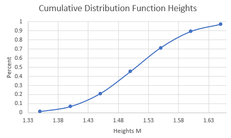
1) Prepare Your Data:
* Make sure your data set is organized in a single column. Suppose your data is in column A.
2) Calculate Mean and Standard Deviation:
* Calculate the mean of your data. You can use the formula =AVERAGE(A:A) if your data fills the entire column A.
* Calculate the standard deviation. Use the formula =STDEV.S(A:A) for a sample standard deviation.
3) Create a Range for X-values:
* In a new column (say, column B), list a range of values that covers the range you expect your data to span. This range can be from the minimum to the maximum value of your dataset or a bit broader. You might want to use regular intervals between these values for smooth plotting.
4) Calculate Cumulative Distribution:
* Next to each x-value, calculate the cumulative distribution using the NORM.DIST function in Excel. If your x-values are in column B, and you put the mean and standard deviation in say C1 and C2, then in column C, you would use: =NORM.DIST(B1, $C$1, $C$2, TRUE) and drag this formula down to apply it to all x-values.
5) Plot the Data:
* Select the range of x-values and their corresponding cumulative distribution values.
* Go to the Insert tab, choose the Scatter plot, and then select the ‘Scatter with Smooth Lines’ option.
6) Adjust Your Chart (Optional):
* Add chart and axis titles.
* Adjust the axis scales if necessary to better display your data.