
UPDATED May 9, 2020. The coronavirus, or COVID19, has swept around the world. However, not all countries have had the same experiences. Outcomes have varied by the number of cases, the rate of increase, and how countries have responded.
In this post, I present coronavirus growth curves for 15 countries and their per capita values, graph their new cases per day, daily coronavirus deaths, and describe how each country approached controlling the virus. You can see the differences in outcomes and when the effects of coronavirus mitigation efforts started taking effect. I also include the per capita values for these countries in a table near the end.
At this time, there is plenty of good news with evidence that many of the 15 countries have slowed the growth rate of new cases. However, several other countries have reason to worry. And, we have one new cautionary tale about a country that had the virus contained but is now seeing a spike in new cases.
About the Graph of Cumulative Coronavirus Cases
The graph below represents the cumulative growth of confirmed coronavirus COVID19 cases starting at around the 20th case for each of the following countries: Sweden, Brazil, Australia, South Africa, the United Kingdom, Spain, Germany, India, Taiwan, Singapore, South Korea, Japan, Italy, and the United States. For China, I had to start with the 548th case given the data available. To facilitate the comparison between countries, I’ve lined up the countries so their 20th case occurs at the origin on the X-axis. Of course, their 20th cases didn’t happen on the same day but, by lining them up, we can compare growth rates between countries. The X-axis numbers represent the number of days since the 20th case, except for China. These data are current on April 30, 2020.
On the graph, you can really see the flattening of the curves for Spain, Italy, and Germany. Compare the steeper middle portion of each country’s curve to their flatter portion towards the end.

For some of the harder to see curves, I’ve included individual country curves in the sections below. Data are provided by Johns Hopkins University and are available here.
For more information about these countries, read my post about Mortality Rates by Country.
Coronavirus Confirmed Cases and Deaths Per Capita by Countries
Below are the per capita rates for confirmed cases and deaths in the 15 countries I cover in this post on April 30, 2020. Keep in mind that these are confirmed cases, as are all the numbers in this post. The true infection rate will be higher. These per capita values are based on the April 30th data. Countries that have an upward slope in the cumulative cases graph will have increasing per capita values over time. These numbers give a sense of the relative impact COVID-19 has had on these countries in terms of cases and deaths while factoring in their population sizes.
The table is sorted by Deaths per 100,000 people from worst to best. Coronavirus deaths are a more concrete measure of the virus’ spread than the number of confirmed cases. Each country’s testing rate can influence the number of confirmed cases.
| Country | Cases per 100,000 | Deaths per 100,000 |
| Spain | 511.90 | 52.60 |
| Italy | 339.82 | 46.24 |
| United Kingdom | 254.07 | 40.40 |
| Sweden | 206.18 | 25.28 |
| United States | 323.16 | 19.26 |
| Germany | 194.56 | 8.00 |
| Brazil | 41.66 | 2.87 |
| South Korea | 20.93 | 0.48 |
| Australia | 27.50 | 0.38 |
| Japan | 11.11 | 0.34 |
| China | 6.06 | 0.33 |
| Singapore | 288.11 | 0.27 |
| South Africa | 9.96 | 0.18 |
| India | 2.60 | 0.09 |
| Taiwan | 1.80 | 0.03 |
The time series plot below tracks the number of coronavirus deaths per 100,000 people for the seven countries listed in the legend. Note that the other eight countries all had less than one coronavirus death per 100,000 people. The last point in the graph for each country equals the value in the table above, which is updated to April 30, 2020.

Now, let’s move on to determining whether these countries have coronavirus under control! There is good news because the data show that lockdowns can be successful!
Western Countries and the Coronavirus
Italy
On March 27th, Italy become the country with the 2nd highest number of confirmed coronavirus cases (86,498). Notably, Italy has started to slow the rate of new cases of COVID19. The news media has reported that Italians didn’t take the warning seriously early on. However, since then, Italy has implemented a nationwide lockdown. The little blip in Italy’s curve around day 19 is when they started the strict quarantine. Currently, all stores are closed except grocery stores and pharmacies. The situation has overwhelmed the medical resources, which has required Italian doctors to perform triage where they determine which severely ill patients should, and should not, get care based on the resources available.
Italy’s graphs show that Italy has successfully flattened the curve. They’ve slowed down the daily rate of new cases and deaths.
On Italy’s cumulative cases graph, the lockdown began on March 9th. Notice how the daily cases graph starts with each successive day seeing a larger increase in new cases. It took 11 days for the Italy lockdown to start producing visible results. That trend of more cases each day reached a peak on March 21st with 6,557 new cases. Since that date, the number of daily new cases has a steady decline. Similarly, the number of daily coronavirus deaths has peaked on March 27th with 919 deaths. Since then, both daily new cases and deaths have further decreased.
The difference between Italy’s peaks for new daily cases and daily deaths is six days. That lag for reduced numbers of deaths is normal because it takes awhile for the lower number of new cases to reduce the number of deaths per day. In about a month after Italy’s peak deaths, daily deaths have decreased by 69%, from 919 to 285.


Notice how the ramping up for both curves to the peak is much steeper than the slower tapering off after the peak. You’ll see this pattern for other countries. As of April 4th, Italian hospitals have reported experiencing fewer numbers of COVID19 patients. It’s great to see that their lockdown is successful! Of course, there is a ways to go before they’re experiencing very low daily rates of new cases and deaths.
United States
On March 26th, the United States became the country with the most confirmed cases of coronavirus. The United States had a slow response to the virus and has had severe shortages of testing. While testing capacity increases, most people can’t be tested currently unless they pass through a screening process. There is no surveillance testing to test for coronavirus spread in asymptomatic people.
On the large cumulative graph, the United States appears to have an even worse trajectory than other countries. However, the United States has started restricting businesses, closing schools, and promoting social distancing a bit earlier than Italy relatively. On the other hand, the United States has had a notable shortage of testing kits, which is undoubtedly causing a substantial underreporting of confirmed cases. Additionally, lockdowns don’t cover the entire country. There’s a patchwork of different restrictions by state and city.
Finally, there is some good news for the United States! According according to the daily cases graph below, the United States appears to have reached a peak in new coronavirus cases on April 21 with 37,140. Although, overall, it looks like a broad plateau that has persisted for 28 days from April 2 – 30. During that time frame, there are typically between 20,000 and 30,000 new cases each day. The peak day for deaths was April 15 with 4,892. The number of daily deaths since has declined since then and settled in to approximately 2,000 per day. However, there are a few notable upward blips. Unfortunately, there hasn’t been a sustained decline in daily new cases or deaths like we’ve seen in other countries.


UPDATED May 9, 2020. An interesting trend to assess is the number of deaths in New York State versus the rest of the United States. Lyle, thanks for the idea! In the graphs below, you can see how up to April 14, 2020, New York had at least 50% of the COVID19 deaths in the United States. However, New York has gotten the spread of the virus relatively controlled compared to the other 49 states. Since April 14, the rest of U.S. has seen the number of daily coronavirus deaths grow more rapidly than NY.


Spain
Spain’s slow response to the coronavirus is similar to Italy’s. Spain has been criticized as having a particularly slow response to the virus. Additionally, a soccer game (futball for non-Americans), between an Italian and Spanish team might have increased the spread much as Mardi Gras is being blamed for an explosive increase of cases in Louisiana, USA.
Like Italy, Spain’s lockdown has slowed the rate of new cases. Spain saw an increasing number of new cases daily until reaching the peak of 9,630 new cases on March 25. After that date, the rate of new coronavirus cases has declined. Spain’s peak day for coronavirus deaths was on April 2 with 961, and it has decrease since then. The lag between Spain’s peaks for daily new cases and daily deaths is eight days. Both graphs show a continuing decline in daily new cases and deaths.
On April 13, Spain lifted some of its lockdown restrictions and allowed construction and factory workers to return to work. However, schools, restaurants, and other services are still closed and Spaniards are asked to stay home. Since that date, there seems be a slight uptick in both new cases and deaths. We’ll track these developments to determine whether these increases mark the beginning of new trends.
In about a month after Spain reached it’s peak for deaths, daily deaths have decreased by 72%, from 961 to 268. In the charts below, you’ll recognize the steep ramping up to the peak followed by a slower tapering off.


Germany
Germany has had a very proactive response to the virus and has aggressively tested for it. You can see Germany’s curve already flattening out. Germany reached a maximum number of new daily cases on March 27 with 6,933 cases. Since that date, the rate of new coronavirus cases have slowed down but then accelerated again. Germany seems to have a double peak for daily confirmed cases. However, since April 2, the new cases have consistent downward trend. The daily coronavirus deaths seems to be declining outside one large spike.


United Kingdom
Until recently, Prime Minister Boris Johnson hasn’t taken the coronavirus seriously. The official policy of the United Kingdom was to rely on herd immunity kicking in after a sufficient number of cases. However, the government began taking the crisis more seriously, the UK imposed a lockdown starting on March 24th, and Boris Johnson tested positive for COVID19 on March 27. For UK’s curve on the cumulative graph, that lockdown began on day 27, which indicates that it took 27 days for the UK to go from 20 to 8077 cases. I’ve added the UK to the chart so we can track the effectiveness of its lockdown on the number of confirmed cases. Despite the late start, the UK’s curve isn’t as steep as other European countries on the chart. Does its geographic separation help?
Lancet, the respected medical journal, has described the United Kingdom’s response to the pandemic as a “national scandal.”
Currently, the United Kingdom seems to be at a plateau of around 5,200 new cases per day with an unusual exception of 8,733 cases on April 10. Additionally, the UK’s rate of daily coronavirus deaths seems to be declining very slowly.


Sweden
I’m including Sweden in the set of countries I’m tracking because they’re trying an unconventional approach. Unlike the rest of Europe, Sweden is not doing a lockdown. Restaurants, schools, parks, playgrounds, and so on, are all open. Descriptions of Sweden’s approach varies based on who you ask. Some describe it as allowing herd immunity to kick in. In this view, the goal is to build up the country’s immunity to coronavirus by letting enough people become infected. Eventually, this process allows herd immunity to control the spread of the disease. In the view of the Swedish government, it is giving the people the responsibility and information to handle it themselves. In this view, the government plays an encouraging role where they provides recommendations but not mandatory requirements.
However it’s described, Sweden is seeing a growth in its number of cases. Unlike Italy, Spain, Germany, and the United Kingdom that are getting coronavirus under control, Sweden is seeing upward trends in cumulative cases, daily new cases, and daily deaths.


Southern Hemisphere Countries and Coronavirus
The number of cases in the Southern Hemisphere has started to increase. Scientists have not confirmed that the coronavirus is seasonal. Seasonal viruses tend to spread more effectively in colder temperatures. Cases might have started growing because autumn has started in the Southern Hemisphere, and temperatures are cooling. Consequently, I’ve added Australia, South Africa, and Brazil to the graph so we can track developments in those locations.
Of the Southern Hemisphere countries that I’m tracking, I have the great concern for Brazil. On the cumulative cases graph, Brazil is following nearly the same curve as the United Kingdom to this point. However, in Brazil’s new confirmed cases per day graph, you can see a large increase on the last two days. Is that the start of exponential growth? Will each day see larger and larger numbers of new cases? Time will tell.
Australia
Australia serves as a good model for how the graphs appear for a country that has controlled the spread of coronavirus. Australia’s chart of cumulative cases displays the familiar steep, exponential growth in cases followed by a leveling out. The daily cases show a rise to the peak on March 28th of 497 cases followed by a consistent decline. Deaths remain in the single digits throughout.


Brazil
Brazil’s graphs for daily cases and daily deaths both show an upward trend. Sadly, in the last several days, Brazil has experience a dramatic increase in the number of daily coronavirus deaths. They’ve doubled from 200 to 400 per day.


Asian Countries and the Coronavirus
Taiwan, Singapore, and Japan are all squished at the bottom of the large cumulative cases chart at the beginning of this post and they are hard to distinguish. These countries have tiny numbers of COVID19 cases because they haven’t experienced the exponential growth that occurred in other countries. South Korea had a period of sharp increase, but that has quickly leveled out. What did these countries do?
Previous experience with SARS, a coronavirus oubtreak in 2003, has taught these Asian countries how to act quickly and effectively. These countries enacted early travel restrictions, large-scale testing, contact tracing for confirmed cases, and aggressive quarantine rules. Additionally, the MERS coronavirus outbreak in 2015 exposed the problems that a lack of test kits will cause.
These policies contained the virus in Taiwan and Singapore and slowed the infection rate in South Korea. Western countries, and elsewhere, haven’t had this experience with SARS and MERS, which has hampered the effectiveness of their responses.
South Korea
South Korea is a great model for a country where coronavirus got a foothold but then they fought back successfully. They reacted quickly and used massive testing, 5X times more than the U.S. on a per capita basis, performed aggressive contact tracing, and quickly quarantined cases. They currently do not have a lockdown. The three graphs below tell this story. The cumulative cases graph shows the sharp increase associated with exponential growth and then the flattening out of that curve.
The two graphs below that show the daily new coronavirus cases and coronavirus deaths. You can see the rise in new cases, followed by a plateau, and decline. Currently, South Korea has about 50 new cases and 5 deaths per day, which has been very consistent for several weeks. With more time, we can hope that the graphs of new cases for Italy, Spain, Germany, and the U.K. will have the long tail of very few cases and very few deaths that you can see below! That’s what we’re all working towards!


Singapore
Singapore is a cautionary tale about the rebound in coronavirus cases that can occur after containing the virus. In January, Singapore was one of the hardest hit countries after the virus spread from China. However, a strict surveillance and quarantine regime contained the coronavirus. Recently, Singapore has experienced a spike in cases that is being driven by migrant workers. Most of the new cases occur in migrant workers who live in large dormitories. Health officials are now isolating the infected migrant workers. Fortunately, coronavirus deaths have not increased. We’ll keep tracking the changing in Singapore.
New confirmed coronavirus cases peaked on April 20 with 1,426 new cases. Since that date, there’s been a consistent decline. Interestingly, Singapore has not seen any increase in the number of daily deaths.


Japan
Japan has had a rather lax response to coronavirus. It has had a very low rate of testing and no social distancing measures until very recently. As of April 12, Japan has tested only 67,000 people, including only 7,000 in Tokyo (population 9.3 million). Japan was very hesitant to postpone the 2020 Olympic Games but eventually did so. However, their number of confirmed cases has remain low. Of course, the low testing rate, about 1200 per day, will help keep the numbers low.
The daily number of new cases rose to a peak on April 9 with 863. The 21 days since that peak show a downward trend where new cases have declined from 863 to 193, which is a 89% reduction.

China
What about China, where it all started? The number of cases of coronavirus in China is over 81,000 as I write this blog post.
China experienced a period of exponential increases in COVID19 cases, but that has since leveled out. China was criticized for initially responding slowly and even covering up the virus. However, beginning on January 23rd, China started severely restrictive lockdowns and quarantines on its cities. On the chart, China began its restrictive measure on day 1 of the graph when it had 548 cases. These measures were so restrictive and on such a large-scale that they have been described as being possible only in an autocratic society.
Despite these extreme measures, it took about 30 days and an additional 80,000 cases before the curve flattened out. That’s the cost of delaying!
Like South Korea, China is a great model for how the data looks for when a country controls the spread of coronavirus. The cumulative cases have that steep, exponential rise followed by a flattening out. The daily cases rise to a peak and then decent to a long, low tail. Daily coronavirus deaths also rise to a peak and then decent to its own long, low tail. I realize there are questions surrounding China’s data. However, I believe that they have controlled the spread of coronavirus.


India
India is currently in the midst of a lockdown. It’s clear that there are positive trends in both the number of new daily cases and the numbers of daily deaths. It’s been reported that India has a low rate of testing. Currently, I don’t have good information about what is happening around the country. I’ll add more information as I find it.


What Happens Next Depends on You!
Graphing the data can be a surprisingly powerful technique for understanding complex problems. The line chart shows how countries have had very different experiences with the coronavirus. By linking the quarantine and testing practices to the different outcomes, we can see which approaches work and what happens when countries don’t implement these measures.
It’s uncertain whether Italy and the United States will match China in the number of cases and how quickly they might do so. There are undoubtedly other countries which are in the same general situation. While the future is uncertain, experts know that early, serious efforts are far more effective than late or halfhearted measures. Please take all the guidelines from your medical professionals seriously! COVID19 is serious business and can easily overwhelm medical systems if too many cases occur at the same time. We need to flatten those curves!
Read my post about the exponential growth of coronavirus and how it relates to hospital capacity. For other virus related information, please read my post about the effectiveness of flu vaccinations.
Stay safe out there! And, please follow all the protocols recommended and required by your local authorities!

You people always say that China is lying, China is underreporting, China is not making sense…
The only reason is that you do not believe the western society would fall far behind to a crowded dirty developing country, right?
The data used by Jim was from JHU, and I am pretty sure that they want to report their data accurately.
If you check China’s data by provinces (oh yes, there are many provinces in China just like different states in the US), many province reported 0 (ZERO) new case for more than 180 days. Think about it, this would be the worst lie ever, if you get to know one of your neighbours/friends/colleagues who got sick in the same province, the “inaccurate data” would be found out immediately.
You are making judgments without any evidences but full of bias. I received my full education in western countries, and wanna ask where your “critical thinking” is now?
Hi Jim(long time)….Charles
Looks like we may be exceeding the total deaths of Italy,Spain,Germany,UK,and France even before my Aug 4 assertion. And, given our comparable population to those countries, I find it astounding.(We may at some point even overtake the entire EEC,including UK).! Aside from the politics(of who knew what,when and reacted or are continuing to react in whatever perceived manner to this pandemic) the fact(IMO) remains:
If you observe the current graph of decline in deaths(from apex) of Europe, there is no reason to believe that the US(with its “vastly superior” health care and top medical facilities in the world) SHOUlD NOT HAVE AT LEAST MATCHED or BESTED that curve.
Furthermore, you could cumulatively add(day for day) the difference in deaths from this theoretical graph to the actual deaths graph, for the entire period of deviation and see how MANY UNNESSARY LIVE WE HAVE LOST!!! Im not making light, but I attribute it mostly to our stubborn resolve to preserve our liberties(refusals to enforce masks,restrict travel,etc way earlier) combined with efforts to reopen too soon. So “Give me liberty AND give me death”. Seems to be the prevailing sentiment of late.
Dear Jim,
Quite interesting your analysis is. Could you throw more light on India as the cases are drastically increasing even though India had the stringiest lockdown. I am sure your insights will surprise many enjoying and playing with statistics here.
Jim, good job, the way you analyse the curve of Covid-19. You have indicated that Taiwan and singapore have done a good job in terms of containing the spread o Covid-19. But you didnot show the curve from Taiwan even she is number one ranking among this countries/ area. You mentioned the causes of low virus spread is sceondary to their experience of having SARS in 2003. That is a good obervation and non-bias, I concur to that. From C.S. Leung,MD from NYC
Thanks and congrats on finishing your book. A big achievement!
Jim! Where have you gone?!
Updated graph of US case progression with separation of NY from other 49 states would be so interesting right now…
Hi Robert,
I haven’t vanished! I’ve just been really busy finishing up my book on hypothesis testing! Finishing that has been my top priority. I’ll see about updating that graph soon.
Valuable statistical information. Could you please help me with the information of total number of covid19 cases, recovered cases, death cases date wise for the whole world for the past three months or so.
Hi, I include a link for where I get the data in this post. It includes what you’re looking for.
For a long time I did not believe the China data but now I tend to believe it. The “old silk route” countries and countries with BCG vaccinations have 2 orders of magnitude less deaths/million than the US and most of Europe.
It would be interesting to know the Corona death rates in asthmatics, those with hypertension, obesity, etc. Do you know if data like this has been collected?
Hi David,
I’m sure they’re collecting data and analyzing fatalities rates for all types of conditions. I don’t know what those numbers are though.
Are you sure about data from China. Because earlier it was the same country that hide the corona outspread. Could we really trust data coming from China.
Hi Jim
Thanks for breaking out the NY data and comparing it with US-non-NY data.
Would you happen to have a link to a site that allows one to selectively choose states and generate those data? Or is that something you whipped up yourself using the raw-data input?
I found a site that can break out country data, but so far no luck finding one that works US.
https://ourworldindata.org/coronavirus
Thanks again for all the great stats
Jay
I’m always curious to read your next update, specially on the brazilian curve, because it will not take long to become the second country in number of dead cases. Being it a continental country just like the US, a per state analysis for both must be considered.
Hi, this data is very interesting. It has come to light that Covid19 has been present in France, the UK and elsewhere much earlier than officially recognised. The Telegraph reported on 3rd January that there had been a strange ‘flu spike’ 10 times worse than normal and many people are asking if they may have Covid19 over Christmas and New Year. If this virus has been spreading and mutating longer, how could this have influenced the numbers we are seeing now in the UK and parts of Western Europe? Could a mutation be hitting is harder? Could it be we were just unlucky enough to have had infection sent in earlier thanks to incoming travel from infected areas more than other countries?? Are we already in the 2nd wave??
Hi Cheryl,
That is interesting. We’ve had a similar thing here in the US. I think the key will be to test samples to find out which cases of “the flu” were really COVID19. I’m sure there’s more to come on this story. I don’t think any of that changes where we’re at today or what we need to do to get it under control. We’re still in the same situation regardless of when it first showed up in each country. But, it’ll be an interesting addition to the story knowing when it started circulating.
I read there was a mutation in March that made it even more contagious. I’m not sure if that mutation caused it to be more deadly per case.
Why is that you single out the UK, whose approach has been a mixture of Sweden’s and France’s, with similar issues to everyone else with regards testing etc, why is the UK singled out with a negative quote from The Lancet about being ‘a scandal’?? Has no other country had criticism like that from its press or is it just Brit bashing? Sweden has had no lockdown yet no criticism there. Why the bias?
Hi Cheryl,
I have nothing against the UK. Or any country. I’m just comparing countries with different policies and tracking the outcomes. Unfortunately, the outcomes for the UK are that great. They’re not great for my country either! I’m just shining the cold hard light of data across a set of countries to see what’s working and what’s not working. I wouldn’t say that Sweden’s approach is working either. Their rates are higher than their surrounding countries. Pay particular attention to the per capita table and charts in this post. Sweden is right up there with other countries that aren’t doing well.
Great work, please keep it up!
I noticed a puzzling periodicity (weekly) and correlation between US new cases and fatalities graphs https://coronavirus.1point3acres.com/en.cve.
Do you have any explanations ?
Jim,
I’ve noticed that the daily positive test results in relation to the total number of tests given is greatly different from state to state as well as from date to date. Obviously some states have the luxury of being able to administer more tests relative to their populations, but it is even more than that. For instance NY only has about a 3% positive rate now, but had a 20% rate a month ago. I think that this positive test result number can actually be helpful in determining how “hot” the virus is at a particular time in a particular region. What do you think?
Phil
Hi Phil,
I think you’re absolutely right about that. It’s something I’d like to look into more. Both between states and in different countries. But I haven’t been able to find good data for that for multiple locations and over time. I do think it’s a good measure. As you say, it’ll provide an idea of how “hot” virus is in a given location at a given time–particularly if you can track that value over time. I can imagine that the percentage might be inflated in a location with lower amounts of testing. However, if you can track it over time, you’ll still get a sense of whether it’s improving for that location.
Hi Jim!
I’ve just found your blog and I find it very useful. You are correct. I have been following the data and it is clear that even the countries (from what we can call the ‘first wave’ as other countries such as Russia or Brazil’s Daily numbers are alarming) that initially got it wrong (Italy, Spain and France mainly) have seen their daily cases and deaths dramatically decline though they have considerably increased their testing. I sadly don’t see that same trend in the UK or US. Even among those who got it wrong we got it worse… I think we haven’t yet been able to get on the right track… Do you think it would be useful to get and study the data about active cases and daily recovered? I would be interested in it but I don’t know if it would contribute something to the study…
Thank you!
“Fascinating.” –Spock with raised eyebrow
Thanks Jim.
YouDaMan.
Thanks Jim. You’re right, even the deaths after the peak indicate a long drawn out recovery. And that’s without a second wave coming into play.
Take care, stay safe and we’ll all learn something from this crisis.
Cheers
Lyle
Hi Jim
Thanks for adding the chart (US Deaths minus New York). Nice work. The cumulative chart certainly highlights the clear upward trend for the remaining 49 states.
More so, a Daily Absolute version of this chart for ‘New Cases’ & ‘New Deaths’ makes this upward trend for the remaining 49 states even more alarming. The US is clearly a long way from hitting its peak.
Keep up the good work
Lyle
Hi Lyle, I just added a daily new cases chart below the cumulative. One thing I’ve noticed from NY and countries that have hit their peaks is that at about one month after the peak, they still have about 50% the daily deaths as they did at their peaks. It’s better, but it’s still many deaths.
If the White House with limited and controlled access, the president, wife and son tested daily, the vice president and wife tested daily, and the others tested every X days, experiences two infected persons, what does that say for the ability of most buildings, offices, factories, shops, etc.,to control or reduce infections?
Agreed. Another interesting point is that after the White House recognized the problem, they’ve instituted daily testing, contact tracing, and quarantines for the infected. That has worked in place like South Korea and should be the practice for everyone. Although, testing everyone every day wouldn’t be practical, there needs to be a very large increase in the amount of testing. I’ve heard knowledgeable estimates of 5 million per day in the United State whereas we’ve tested 8.8 million TOTAL.
We know this process works in other countries where they’ve been able to both keep the economy running and keep COVID19 under control. We need to dedicate the resources necessary to accomplish that.
Hi Jim,,,its amazing how this blog seems (imo) to be evolving with different enlightening ways to approach,analyze, and present the data.Kudos to you and all the deep thinking contributors from all over. Just yestersay I added up the populations of Italy,Spain,UK,France,Germany to total 324mil vs U.S with 330mi?. I thought it might be neat to then present their data as a sort of weighted “Euro block” average curve.(specifically deaths per day DPD and/or DPC).,Might be complicated, but then we could track U.S. curve vs thiis curve,allowing us to maybe model several weeks ahead(even though UK is within a few days of U.S.)….or maybe use the 7 day moving avg curves…???
Also, does it seem possible we could surpass TOTAL DEATHS vs this “Euro block” by the much talked about Aug 4 date??…as we already lead in cases,new cases,etc
Hi Charles, I, too, think it’s great how it has evolved. Both the state of the virus and ways of presenting the information has evolved. I’ve just added a new chart to the United States section based on a reader’s recommendation that compares NY to the rest of the US. I think you have a great idea about comparing the US to a Euro block. That might even be a different blog post altogether. I will think about that!
OK, thanks Jim.
re: Sine Waves seen in the Graphs.
Hmm … your theory of reporting cycles is interesting.
I was thinking that it is perhaps related to the avg 5-7 day incubation period. In that, with 100 of us in a room, and an R0 of ~2, then every “(5 to 7 days) / 2” there is a dip in the graph during incubation. Then a corresponding rise as those newly-incubated cases become symptomatic/tested/confirmed.
Rinse and repeat …
Hi Jay,
I don’t think that’s how viruses work. Say you start with one infection. That person will infect others on different days. Those secondary infections will infect others on different days. And, so on. It should smooth out the line for new cases.
This really seems to be a case where human schedules are creating artifacts in the data. It’s consistently a 7 day cycle with the lowest days being on the weekend. That’s a human aspect rather than related to the virus.
Hi Jim
The push to re-open the US economy appears to be the main focus at present, presumably due to the perceived downward trend in New Cases & New Deaths. However, that presumption could be heavily biased by the weight of New York on the National figures.
Are you able to produce a National chart for New Cases & New Deaths on a Daily absolute basis, but exclude the figures for New York State? From what I have heard and seen this produces a chart with a definite upward trend. Can you confirm?
Hi Lyle,
That’s a great idea! I added a new chart at the end of the United States section that compares the US minus NY to NY. And, yes, you can see that there is an upward trend. Check it out!
Thanks for the analysis. I have been looking for a source of data that shows a sorted list by state of the change in death rate over the past 7 days. Maybe a metric where 0.0 means constant death rate, 1.0 means it doubles in a week and -1.0 means it halves in a week. I think something like that would be useful in visualizing the effect of the different strategies each state is using.
Hi Richard,
For a metric that specific, you might have to download the data and calculate it yourself. Although, I believe cases right now are growing more linearly than exponentially. And you’re suggesting an exponential scale. You could also calculate the weekly growth/reduction percentages and track those. The value for each day would be the change of the past 7 days compared to the previous 7 days represented as a percentage.
I think some of those representations can be helpful. However, one reason to stick with the number of cases/deaths per day is being we’re dealing with people those numbers represent actual people. But certainly including some additional rate of change type information with that could be helpful.
Heya Jim.
Thanks for all the great Stats Talk. “Oooo, talk statistics to me, baby” : )
Remember when I posted a blurb a week or two ago about how the Cases/Death Graphs were beginning to establish near-perfect Sine Waves?
Well, someone at WorldoMeters noticed too. Wait till you see the SW lines they added to the Graphs. (I wish they made the newly-added lines optional/clickable, though, since it’s not really a pure graph to have ’em in there.) But no matter, they still look great. Perhaps they will change it to an option.
Take care and stay safe and thanks again for all you do
J
Hi Jay,
LOL, nothing stats talk! 🙂
I have theory about that type of pattern that is particularly strong in the data for some countries. For example, it’s really noticeable in Sweden’s daily deaths. I think it’s a 7 day cycle that fits a weekly pattern. My guess is that’s based on days that coroner’s offices, medical examiners can officially file cause of death certificates. Something like that. They might be less likely to do that on weekends. So, while the death will ultimately be recorded for the correct day, in terms of the data that is release through these sources, it won’t count until it’s officially filed. Or maybe it’s linked to when the certificates will be counted and recorded by a clerk who doesn’t work on weekends. I’m pretty sure it’s something like that given the weekly cycle. The lowest point in each cycle is consistently a Sunday.
Looks like they’re a three-day moving average, which is odd. When you have time series data with a cyclical pattern like that, if you use a moving average, it should be the same length as the cycle (i.e., 7 days).
Jim,
I don’t understand why we haven’t see a graph of the US versus Europe or SE Asia, etc. It’s not like the European countries borders have some magic to prevent the virus from moving from one country to another. It’s the same thing when we don’t see NY compared to Utah, etc.
Hi Dusan,
Partially, it’s just how the data are reported. It is possible to combine the countries into a say European summary. However, part of the interesting aspect of seeing the individual countries is to compare their different approaches to their different outcomes.
Similarly, it would be interesting to compare NY to Utah, and all the states to each other. I did a bit of that in my post about coronavirus hotspots.
Hi Jim- Thanks so much for great analysis and understandable presentation! Its very helpful to get a different angle on the situation by comparing curves. I’m a psychologist in Bend, OR trying to help people understand that the US has NOT “beaten coronavirus.” Ie, that our numbers look “OK” because most data doesn’t account for testing rate or selection. Do you have any info on the case and death rates per capita by country that adjust for testing? It’s hard to convince folks that distancing, comprehensive testing and contact tracing are needed when the data makes it look like we have less spread than a country that’s done twice as much testing. Thank you so much! Take care, Linda
Hi Linda,
I’d love to be able to adjust for testing rates! It’s harder to find testing data. And, even when you do, it’s usually total tests done rather than during a specific time frame. I have heard that South Korea had 5X the testing as the US on a per capita basis. Germany also has a very high testing per capita rate. But, I don’t have updated data for all countries.
However, deaths by COVID19 is more independent from testing rates. If someone dies from COVID19 symptoms, they are usually tested and counted accordingly. It’s a more concrete number that is less affected by testing rates. And suddenly doubling or tripling the testing rate won’t cause a similar increase in COVID19 deaths. That’s why in the per capita section, I sort the table by Deaths Per 100,000 and show graphs for deaths per 100k over time and on a daily basis. And, the fact is that the number of daily deaths in the US just hasn’t declined. We’re holding steady at approximately 2,000 COVID19 deaths per day. That’s not due to an increase in testing.
Thanks for writing with the interesting question!
Thank you for your excellent work. You only deal in actual data to construct your graphs. One can assume a trend form these to some future time. I have not seen a comparison of the area under the curve of expected deaths using the two scenarios: Let the virus take its own course (Sweden model) or flatten the curve ( almost every other country). The reason I ask this is that flattening the curve also extends the length of time the virus is around while not overloading hospitals. It will eventually reach everyone, but at a much later date with the second scenario.Also an expert suggested that this is so virulent that herd immunity will not be reached until 90% of the population has been exposed to it. The expert said normal herd immunity for a flu type virus is reached at 60-70%. Let’s hope for a vaccine to stop this. Also the US average death rate for all causes minus auto accidents is about 7869 per day (2,872,185 per year). I want to make myself clear that I’m not advocating one method or another. I just would like some perspective.
Thanks again.
Hi Richard,
I think those are excellent questions. I’ve intentionally avoided more sophisticated modelling for two major reasons. One, the data we have right now is so poor and incomplete. Both in terms of the things like the number of cases, but basic information about the virus, such as its true fatality rate–which is linked to the number of cases too. Second, this is such a specialized area with serious consequences that I’ll leave it to the experts in the field rather than “dabbling.” But, I’ll note that even the models by professional epidemiologists have large margins of error due to the large uncertainties.
I think eventually there will be interesting models comparing the different approaches and the spread of the virus. These models might factor in a variety of variable including social distancing measures, testing rates, population densities, demographic factors, and even climate factors such as temperature. For example, I wonder if Sweden’s lower population density is helping contain the virus. Although, I’ll note that while most of Europe seems to have passed their peaks and are declining, that’s not true for Sweden. Yet, it’s not spreading quite as rapidly as I would’ve expected giving their lax approach. Although, it does sound like a proportion of people are voluntarily isolating themselves. I don’t know what proportion though.
In my book, South Korea is the gold standard. I country that has a high population density but has used a very high testing rate and aggressive tracing and quarantine procedures to keep the virus under control while having the economy relatively open.
Someone else asked a similar-ish question as yours, and I attempted an answer back then. If you’re interested, you can read it here.
At any rate, I’m sure this pandemic will prompt many studies down the road. Part of the difficulty is that we’re still in the thick of it. And, it’s easy to forget that we’re still at the beginning of it. Over time we’ll get better data and the ability to reconstruct what has happened, the timing, and link it other factors.
Thanks for writing!
Jim: I visit your site daily. The old format for your first graph was very useful since it provided the simplest, single-glance illustration of US coronavirus policies, versus other countries. I understand why you made the change, and I can still glean the same info for my own consumption. However it would be useful to show the prior version of your first graph, perhaps somewhere on your website. Ed Davis
Hi Ed,
I’m glad you’ve found this post to be helpful! I’ll have to think about that issue. I like how you can see more detail in the graph without the U.S., but I agree that comparison was also valuable. Let me think about that and I’ll make a change in the next several days.
HI Jim,,,,Since each country’s total cases and deaths are relative largely to total population and various mitigation levels employed,would it be useful to linear graph cases and deaths per 100k in order to guage the effectivenes(Or lack thereof) of each nations response against each other (Particularly interesting would be Sweden “grand experiment”,,) Also,unless u.s. deaths start to radically decline, looks like our inevitable elongated bell curve may result in an upward revision of total mortalities(from the downward revisions)
Hi Charles, your wish is my command! I’ve added two new cases per 100,000 charts right under the table near the beginning. I’ve started with cases, but will likely add deaths soon.
I’ve noticed that it’s taken around three weeks in Italy and Spain for their daily deaths to decline from the peak to about 50%. Unfortunately, if that pattern holds in the U.S., we’ll unfortunately continue to see a high number for a while.
Hi Jim. Thanks for a useful article.
Looking at the semi log graphs it’s often hard to see changes in the slope. Is it possible (and useful) to graph the slope of these curves over time?
Richard
Hi Richard,
I’m not using semi log graphs. I’m using the normal, linear scale for plotting cumulative cases over time, daily new cases, and daily deaths in the various graphs. So, they all incorporate various measures over time. Specifically, which graph wasn’t clear? I know some of the slopes in the large cumulative graph are hard to distinguish. I do plot the curves for some of the individual countries in their sections when it’s hard to distinguish their curves on the big graph.
If one of the countries isn’t clear on the big graph, look at their section in article to get more details.
You’re spot on about the log scale in the very helpful Guardian chart. My bad, I didn’t notice; argh! And I also agree with you that both your zoomed-in linear chart and the zoomed-out log chart are correct — two views of the situation that together give a more accurate and honest take.
So my rec would be for you to include both charts. That way readers will see a more veridical picture because the showing only the linear mode chart lends itself to the fallacy of what Dr. Nicolas Bissantz in 2011 called a
Panic Chart (see his blog Me, Myself, and BI):
https://www.bissantz.de/bissantz-ponders/linear-vs-logarithmic-scales/?lang=en
His take on the vulnerability of a solo linear plot (a partial picture of data) to be construed as a Panic Chart is seconded by statistician Naomi Robbins in 2012:
https://www.forbes.com/sites/naomirobbins/2012/01/19/when-should-i-use-logarithmic-scales-in-my-charts-and-graphs/#c5de2f95e67b
Yet you aren’t trying to stir up panic, Jim. You’re trying to help us all in your small way to understand a confusing situation. And by including both ‘zooms’ (magnifications of the dataset), you’ll avoid being mistaken for one of those dubious stats people whom Mark Twain lamented in the famous quip: “There are 3 kinds of lies: lies, damned lies, and statistics.”
Conversely, the Guardian should also include the linear chart you’re so fond of in order to convey the most full, contextualized picture. If so, we’ve put our finger on a flaw in the system of our int’l knowledge sharing: some sources show us partial truths, others other parts; yet we want the whole, right? I hope you’ll take what I’m suggesting in a constructive way. : )
Davy, I hope you’ll take this as constructive criticism, but we have polite discussions here. We don’t come in with insinuations about not updating charts and stating things must be wrong. If you have questions, or wonder why I present data in one way or another, that’s all fine. If you disagree, that’s also fine. But, we do it politely here and without snide comments. Future comments with that tone will NOT be approved.
So, on to your questions.
There is not one correct way to present this information. I disagree with Bissantz that log charts are always better. Log charts have their uses. I know because I’ve written an article about log charts. They’re handy when you want to focus on the percent change or rate of change. Linear charts are better at showing the true trends in the data, absolute quantities, and relationships between absolute quantities. You just don’t get a real sense for those aspects from the log charts because of the distorted scales. Your misinterpretation of the log chart in The Guardian article highlights that problem.
My approach here was to provide an overall picture of the trends and absolute values for a variety of countries in the large cumulative graph. I then provide per capita values to put those numbers in context for the population of each country. Next, I present the daily values for the countries for both new cases and deaths. These charts highlight whether a country is seeing an increase, decrease, or holding steady in terms of the rate of change. This is my approach instead of using log charts because they are easier for most people to understand and yet present similar information as the log charts. These daily charts make it really easy to see when a country is still rising to a peak, at the peak, and declining from the peak. They do that without distorting the scaling, which is confusing for some people.
By doing this, I’m following the advice contained in your second link:
“Logarithmic scales are extremely useful but are not understood by all. As in all presentations, designers must know their audiences.”
I’m just using a more intuitive way of presenting that type information to make it accessible to more people and yet still provide the full picture.
I always put a lot of thought into how to present information. Of course, you’re free to disagree.
It looks like your primary graph is not being updated, contrary to your “updated on April 22nd” announcement at the top, and your “These data are current as of April 21st” assurances.
For example, your USA curve still looks like a rocket taking off, whereas a chart from the UK Guardian, also derived from Johns Hopkins data, shows a leveling off trend. Both charts can’t be right.
I realize you already do a lot, but if you don’t have time to update it, then it would be more honest and helpful to take it down.
https://www.theguardian.com/world/ng-interactive/2020/apr/23/coronavirus-map-of-the-us-latest-cases-state-by-state
Hi Davy, it appears like you have misinterpreted the chart in The Guardian. That chart uses a logarithmic scaling. Those curves are flattening out which, on a log chart, means that the rate of increase is changing. However, that doesn’t mean that there has been a decline. Indeed, the article you cite itself states, “The number of confirmed cases of Covid-19 continues to grow in the US.”
Please don’t impugn my words. When I say that I have updated the charts, I updated them. My charts do not use log scaling, which is why they have a different appearance. My charts use natural (linear) scaling. And, you are incorrect when you say, “both charts can’t be right.” The both are correct. However, you do need to note the scaling very carefully. It’s actually unusual that The Guardian is using log scaling for cases that are no longer growing exponentially because, as you’ve ran into, it’s misleading.
Lesson 101 with graphs. Check the darn scaling!
Can you graph an estimated time until a percentage of the population is exposed? Seeing the potential curve after this plateau would be helpful. Some estimates say that 50% or more of the population may eventually become infected. If infections are doubling every 5 number of days (on average), population rates are Y (thousand, million, or billion?). This may help us understand the amount of time the virus will take to affect the majority of a given population. Of course this is simply considering statistics and not epidemiological data. Thanks.
Hi Jim, thanks very much for this- it’s very informative. Could you perhaps include the individual graphs for South Africa, as well?
I like your sensible, considered, rational approach to the topic of Coronavirus and the use of stats. It seems to me that both stats and modelling systems can be useful as tools, but not as methodology which dictates absolute actions. Just a thought.
Hi, using data to understand how various actions affect outcomes is crucial to improve outcomes. Without being data driven, we’re flying blind and using hunches to make decisions.
Looking at daily infection numbers over daily test count, it seems obvious that the hit rate is varying very much from country to country.
The US as a nation seems to be stuck at some 30k newly infected per day, which complies to a hit rate of 20% and some 150k tests per day.
If you compare the hit rate f.e. to Germany (current hit rate less than 3%, initial hit rate 8-10%), there seems to be way to little testing in the US to get a clear picture.
Actually, limited testing makes the “curve” flatten, transforming it from exponential to linear growth. As situation progresses, at least in the US more and more is in the dark.
Doesn´t it make sense to monitor the “hard mortality” (ratio of deaths over recovered). This ratio will asymptotically align with “soft mortality” (ratio of deaths over infected) over time. Reason why i recommend this approach: Recovered (if tested) and deaths (if tested) are the only hard figures to evaluate progress of the pandemia. So why not use them.
Also, doesn´t it make sense to look more on active cases than on infection numbers?
Check out the near-perfect Sine Wave being established in the Global Daily Cases. That’s a good indicator of reporting accuracy, along with Benford’s Law, which the tabulated numbers appear to reflect.
It’s likely we are settling into a Plateau at the levels seen above as other countries start to come on the radar. Note the good Benford numbers in the following — sorted by New Cases.
Benford’s Law states that in many naturally occurring collections of numbers, the leading digit is likely to be small. The most frequent leading digit is 1, the next most frequent is 2, and so forth. With 9 being the least frequent. The Law is used to spot fraud and was mentioned in the movie “The Accountant.”
Gracias Jim!
Greetings from Colombia.
Can you comment on smth I saw today that compared combined population and deaths in Italy, Spain, France, UK and Germany as 320 million population and 55,000 deaths with US population as 328 million and 20,600 deaths. These figures were used to say President Trump is doing a marvellous job. I can’t work out how to fact check these statistics. I imagine a lot depends on where each country is in its curve??!
Hi Katie,
I’m trying to keep this not political, so I’m focusing on the response of each country to the pandemic and their eventual outcomes rather than specific leaders or parties.
With that in mind, you can look at the deaths per 100,000 table near the top of the post to get a good idea of the scale of coronavirus deaths for each country while factoring in the size of the populations. Higher deaths per 100,000 reflect worse coronavirus outcomes while incorporating size of population.
I’d also agree with your comment about the European countries being further along their curves. Some of those countries passed their peaks a month before the U.S..
Hi Jim -,
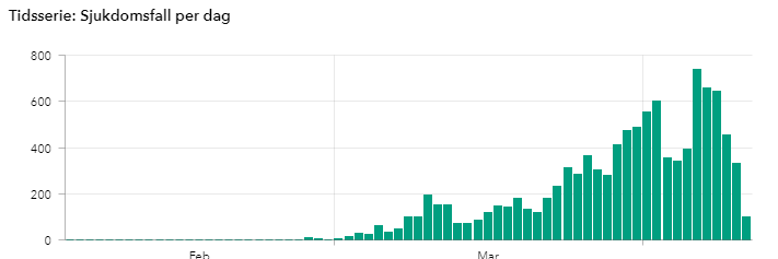
Take a look at the daily deaths graph “Tidsserie: Avlidna per dag”. Yours has days of well over 100 deaths when in fact the highest official reported daily deaths figure is currently 75, there are also very significant differences in the variance between the official data and your unofficial data for daily deaths.
The Swedish health agency have cautioned against using the daily reported cases (the graph you show above) for any analysis as there have been significant changes in the testing strategy in Sweden over time – making any analysis of daily case numbers as a time series deeply flawed. We also know (unsurprisingly) from the health agency’s latest randomised testing studies that the number of reported cases is not representative of the true number of cases (the latest random testing suggest that 2.5% of the population in Stockholm were infected at the time of testing, far more than the number of official reported cases).
The agency’s advice is to use the daily new ICU cases (Tidsserie: Intensivvårdade per dag) and daily deaths (Tidsserie: Avlidna per dag) for any analysis. That’s excellent advice that I’m certain applies to the reporting in pretty much every country, not just Sweden.
Pat
Hi Pat,
Thanks, I didn’t notice that other graph. Not knowing Swedish, it was just a bunch of text of me. I’m not sure why the discrepancy exists. However, I notice that the total number of deaths from both data sources are exactly the same at this moment: 919 total deaths. The two sources might just be attributing the same deaths to different days. For now, I’ll use the data from Johns Hopkins but I’ll look into that more. Both datasets show an overall increase in the number of daily deaths, which is the important point.
As I’ve indicated, all countries are under-reporting coronavirus to some extent. Not everyone who has it is being tested. I’ll also note that Sweden is particularly low on the amount of testing. Apparently, 10,000 people a week are tested in Sweden out of a population of 10.23 million.
However, we can still learn from the data. If the virus is spreading AND you increase the amount of testing, you’ll see an uptick in the number of cases. Even in countries with low testing early on (Spain, Italy, U.S.) we could still see increases in cases.
However, look at countries with very high testing rates. For example, South Korea has 5X the testing per capita than the United States. Despite this large scale testing, they aren’t seeing sharp increases in the numbers of cases. In fact, they’ve passed their peak long ago and consistently have very small numbers of new cases and deaths. The same is true of the other Taiwan and Singapore. Same thing in Germany. They’ve had a very vigorous testing program and they too have passed their peak and are now declining. These declines are occurring while they continue to rapidly test. Clearly, large scale testing doesn’t necessarily mean you’ll see sharp increases in cases–unless, of course, the true number of cases is also growing.
Spain and Italy were behind in keeping up with coronavirus. However, they too have ramped up their efforts. Both in social distancing and testing. Despite increasing testing, we see that these countries, too, have passed their peaks and the number of cases and deaths are declining.
I don’t have ICU data from all countries. However, I include the number of deaths because it is a concrete number and serves the same purpose. It’s also informative looking for the peak of new cases and then being able to anticipate an eventual decline in the daily deaths. You can see how after a countries numbers of new cases starts to decline that about a week later the number of deaths also start to decline. Again, we can learn from these data even though they are not perfect.
You are sort of correct, though I wouldn’t quite say that the number of daily cases is irrelevant. You can find the % positive by going to https://www.cdc.gov/coronavirus/2019-ncov/covid-data/covidview/index.html. However state by state data is much more telling. This data is somewhat tedious to find, but can be derived from https://covidtracking.com/data, and perhaps from other sites. For instance New York still has about 40% positive, and was higher earlier in the epidemic.
There are several caveats in interpreting the percent positive. Most importantly, some labs or localities report no or only partial negative numbers. Also, the patient samples from which the test results are drawn are different at different time points. Early on the patient had to be considerably ill to be tested, so that patient sample had different characteristics that the current patient sample. In a short while, there will be more testing of asymptomatic patients, another different patient sample.
I’ll finally add that, unfortunately, in order to make sense of this data, one needs to know some characteristics of the virus, some technical aspects of the testing (false positives and negatives), some aspects of epidemiology, and any aspect of bias in either obtaining or reporting the data. In the case of Japan, there is deliberate undertesting. In the case of China, there is massive deliberate underreporting (e.g. the number of ordered funeral urns is at least triple the number of reported deaths).
If one is capable of keeping all of this in mind, then the graphical display of imperfect data, especially over time, can be informative. Hence, thank you Jim.
Hi Peter,
Thanks for you additional thoughts on this. Agree the data are less than perfect. But, as you say, I think we can still learn. Undoubtedly, when the dust settles, researchers will be able gather much better quality data that more fully captures what has transpired. At that point, they can do more in depth studies and analyses.
Also, it’s interesting the the countries with the highest testing rates actually don’t show increases in cases and deaths. They’ve largely contained the virus, or are in the process of doing so. We can actually see when countries reached their peaks and start to see declines.
The number of cases per day is an irrelevant statistic…. it is directly proportional to the amount of tests…. if you do more tests you get more cases if you do the same number of tests than the graph shows a FALSE plateau… You can skew the forecast by doing less tests because then you get a false number of new cases ..it will trend down….I also am tracking stats… and It makes me cringe when people use this stat to forecast anything…. it has absolutely NO forecast probability…. the stat that does have forecast meaning is the Positive percentage per testing numbers that is the only relevant number from the cases tested…. So you should not be tracking the cases as any meaningful predictor,,,it predicts nothing…..
Hi Ed,
You’re correct that there is a relationship between the amount of testing and the number of cases. As I’ve said, all countries are under-reporting COVID19 to one degree or another. However, we can still learn from the data. And, some of how this works out in the real world is counter intuitive. So, let’s see what the data show in relation to your assertions.
First, I’ll look at the opposite of what you write. Do countries with low testing rates not show increases in cases? That’s clearly false because countries like the U.S., Italy, Spain, and the UK have had very low testing ratings early on and yet we still saw that steep curve associated with an exponential increase. Currently, Japan and Brazil have low testing rates and yet we still see increases in those countries as well.
On to what you wrote. Does a high testing rate necessarily cause a sharp increase in the number of cases? Well, certainly if the virus is spreading AND you increase the amount of testing, you’ll see an uptick in the number of cases.
However, look at countries with very high testing rates. For example, South Korea has 5X the testing per capita than the United States. Despite this large scale testing, they aren’t seeing sharp increases in the numbers of cases. In fact, they’ve passed their peak long ago and consistently have very small numbers of new cases and deaths. The same is true of the other Taiwan and Singapore. Same thing in Germany. They’ve had a very vigorous testing program and they too have passed their peak and are now declining. These declines are occurring while they continue to rapidly test. Clearly, large scale testing doesn’t necessarily mean you’ll see sharp increases in cases–unless, of course, the true number of cases is also growing.
Spain and Italy were behind in keeping up with coronavirus. However, they too have ramped up their efforts. Both in social distancing and testing. Despite increasing testing, we see that these countries, too, have passed their peaks and the number of cases and deaths are declining.
While it’s counter intuitive, it’s actually the opposite of what you write. Countries that do less testing will fail to contain the virus. The virus spreads exponentially and that’ll show up in their tests even with a low rate of testing. Countries that test widely have had better results for containing the virus. Despite having more testing, these countries have seen a decline in the number of cases and deaths.
So, it’s categorically false that the numbers are declining in those countries because they’re testing less. In fact, as far as I know, no country is testing less. They’re all ramping up their capacities to some degree. The countries with the best results have always had the highest testing rates.
Your data for Sweden is incorrect. I suspect looking at it the data comes from something like worldometer.info who I suspect just take the changes in headline numbers each day and attribute them to that day. So they will be showing the changes for things like deaths on the day they are reported and not the day they occured.
The correct data can be found on the Swedish health authorities website (link below):
https://experience.arcgis.com/experience/09f821667ce64bf7be6f9f87457ed9aa
As you can see the the time series are significantly different.
Hi Pat,
The data I use are from Johns Hopkins and they undoubtedly obtain it from the official sources in Sweden. There might be delays in report and timing issues.
However, I did look at their site and their graph of daily cases looks remarkably similar to mine.
mohfw.gov.in
Hey Jim, use this web site for exact numbers.
Thanks for the thoughtful explanations Jim. I’m not a statistician currently but did a fair amount of stats, regression, etc in biomedical research. One gap in the flattening the curve narrative, is whether flattening curves sufficient to stay underneath healthcare capacity leads to less deaths? It seems like the “area under the curve” of a steeper and shorter curve is equivalent to the area under the curve I see on broader flatter curves. Same number of deaths from C-19, except over an extended timeframe? And would appear in the longer, flatter scenarios the likelihood of increased collateral damage to the world economy leading to related but non-C-19 deaths that have not been incorporated yet in total death models I’ve seen. I’d like to get your thoughts on the area under the curve in both scenarios and whether you interpret that there are fewer deaths with steeper, shorter curves vs. extended flattening. Thanks for your work and opinion on this.
Hi Ed,
Those are good questions, and think there are several ways to think about. I’ll use the U.S. as an example because I have more data.
First, we have to estimate what we would’ve had without social distancing to what we have. In my post about coronavirus and hospital beds, I estimated that we’d have 15 million cases of COVID19 by late May without social distancing. And, that’s based on confirmed cases much less the untested cases. Clearly, we won’t have anywhere near that many by late may. But, let’s say we take that number and flatten it out.
If we had 15 million by late May, our health care system would be totally swamped. We’d need to triage patients and ration healthcare like they did in Italy. People who could’ve been saved would die. However, if we spread that same number out over a longer time so the medical system wasn’t swamped, we wouldn’t need to ration healthcare. Patients would, unfortunately, still die but it would be a lower number. Patients wouldn’t be dying due to a lack of equipment and personnel. I don’t know what that difference would be but having such a large number in a such a short time would have been catastrophic.
Another way to look at it would be by modeling results. Initially, the models indicate there would be 1-2 million deaths by August without social distancing. Instead, we’re looking at about 60,000 deaths in that time frame. The numbers are lower thanks to social distancing. Still tragic, but many orders of magnitude better.
So, I have no doubt that social distancing has saved a huge number of lives in the U.S. alone. It’s a real tribute to the regular person for following the social distancing protocols. I think what we’re seeing practice is that social distancing worked better than expected. It didn’t just flatten the curve but it also kept it relatively short.
I also see a way forward that doesn’t require a permanent lockdown until a vaccine or other effective treatment. South Korea is a great model for a country that uses massive amounts of testing, aggressive quarantines, isolation, and contact tracing. They’ve managed to keep their economy open and yet still keep the virus contain, as shown in the graphs in their section of this post. However, we need to get a system like theirs into place before we can expect to have their results.
First, Steve B-I am at a loss to understand your contentions, sorry. Second, Jim-Apparently, the East Coast strain of the virus arrived from Europe while the West Coast strain of the virus arrived from China. Is it procedurally correct to mesh this data-are they apples and oranges (the different strain)? Is America looking for two different vaccines?
Hi Mark,
That’s a great question about the different strains. I don’t think anyone knows the answers yet. As of now, I haven’t heard that the strains are remarkably different in terms of virus characteristics. I think these are subtle mutations at this point. However, it does make me wonder about the reported large number of false negatives in the tests. Is the failure to detect the virus due to mutations.
Definitely an issue to keep an eye on!
Jim,
This is a fantastic response to a naive, reactionary, impulse response from Steve. Your analysis is right on.
Bottom line…we need more (and more accurate!) testing. And we need serial testing in patients with highly suspicious symptoms who test negative.
Kevin
It is simply is not true that quick
and decisive responses explain densely populated counties having such low rates of infection. And the popular refrain about lack of testing doesn’t hold water, because their death rates are even lower yet! Reflexively parroting official narratives according to the media-entranced USA perspective won’t lead to igrester insights and real solutions. Are India and Pakistan ahead of the US in strength and speed of response? Not a chance, nor are they keeping six feet apart, which is often difficult with the infrastructure and customs in their high density cities. Why omit the death rates for India? It’s quite telling. Russia, Hungary, Mexico, Indonesia and many more have exceptionally low death rates. Tibet, a province of China, has reporting but one (1) case of COVID-19, one full recovery and zero deaths. They can’t all be lying except us can they?
While I believe your efforts are well intended, it is clear that most western researchers and academics are preparing their statistics through a prism that confirms their own (subconscious?) biases. My stats professor would’ve flunked me for submitting the kind of skewed work that has become accepted by today’s lower standards of objectivity.
Are we asking the right questions? Does solution-by-isolation mean we don’t need to find out why this virus rages in our backyards like virtually nowhere else? And why isn’t any our 24/7 “world class” media pointing out these inconsistencies? Ordinarily they thrive on controversy and rush to be the he first to publish a new angle. Not if the topic is contrary to the established narrative it seems.
Fear is the enemy of objectivity. What we should REALLY be asking is, “what is going on in these western countries to be causing disease factors at multiples compared to poor countries with less sanitation, less “education”, less so-called “health care”, less food additives, less WiFi, much less media hype, fewer vaccinations, lower use of pharmaceuticals but maybe much more common sense.
Are we afraid to ask these questions? Will those who do be shouted down as “anti-this/anti-that” and discredited with labels rather than deeper research into all the facts, and not just those that fit the official story? Let’s tear off the blindfolds and come together to solve this serious issue by looking at everything, even if it’s uncomfortable for us to do so.
First thing Steve. Take a deep breath and step away from keyboard for awhile. These is a statistics blog and we talk about the analysis calmly. We have polite conversations here. We don’t hurl insults and accusations in an effort to make your point. And, I don’t control the media, so don’t direct those criticisms here. This is your one and only warning. Knock it off!
As I’ve repeatedly pointed out there are various problems with the data. ALL countries are under-reporting COVID19 cases. However, some are doing more so than the others. I suspect many third world countries have very low resources for testing. Yes, we get it. The data are not perfect. However, it can be informative to compare some countries. The U.S. and the European countries. And the Asian countries to who have contained it. South Korea has conducted five times the amount of test as the U.S. on a per capita basis. And, yes, that is how they contained it–with massive testing, quick actions, and sufficient supplies. For example, most of their citizens have always worn masks outside during the pandemic. They didn’t have the shortage of materials that we have. As I discussed, they learned from SARS and MERS. We did not. There’s a lot to learn from them, Taiwan, and Singapore.
Are there other questions to ask and other potential solutions? You bet! Right now we’re in the pandemic. However, you can bet we’ll have in-depth studies looking at all different angles when the urgency of the crisis passes. It’s not fear. It’s not blindfolds. It’s the lack of time in an ongoing crisis. It’ll also take time to get that good quality data that reliable studies require. I personally have not conducted more sophisticated modeling because good data do not currently exist.
Do not worry. There will be tons of research into the COVID19 pandemic for years to come. There will be efforts to understand what factors helped it to spread and which factors hindered it. They already do just that with known diseases–and that includes things that you mention: sanitation, education, health care quality, and so on. You bet they’ll do that with this new one.
Sir checkout covid19India (dot) org
It appears as if death rate among closed cases is 21 to 24%
As per world o meter website death rate among closed cases world wide and majority developed countries seems to be 18 to 25 %.
Patients with zero symptoms ( if they recover without issues)
we dont care in India.
I do not want u to care too
Death rate among Patients diagnosed and closed cases seemsnto be 21 to 25%
So can we consider that 1 in 5 cases diagnosed with( symptoms + lab tests) will die ?
Hi Winith,
No epidemiologist in the world thinks the mortality rate is anywhere near 20%. You need to use all deaths/all cases. Given that we’re in the midst of the pandemic and most cases are not resolved (recovered or died), you cannot use only those cases with an outcome. Using the all deaths/all cases will asymptotically approach the correct answer.
Read my post about coronavirus mortality rates to learn more. But, no, don’t fret, 1 in 5 confirmed cases will not die. Last I checked, it was about 2.5% in India.
Hi Jim,
Almost same ending numbers day after day….remarkable!
Do you think the recent reduction in projected U.S. deaths by the expert projectionists are due to their approach of trying to use an r-naught “empirical formula” methodology, rather than looking more closely at the actual data from around the world? Because, correct me if i’m wrong, r-naught can only be held constant if all the other parameters(..ie varying levels of mitigation} are finitely known beforehand, which is next
to impossible..
Or possibly at that time,they saw how steep our curve was compared to Italy’s and just extrapolated out?
Also, Germany and Austria( with similar death rate , infection rates as U.S.),as opposed
to Italy,Spain, France, both hit their apparent peak cases and deaths 13 DAYS apart. Any possinbl correlation or just coincidence?
Hi Charles,
It is great news!
I think the expert models incorporate many factors including R0 and numbers from around the world. Apparently, the recent reductions in the number of predicted U.S. deaths was due to new data from Italy and Spain. R0 is affected by the lockdown status. I’m not sure how they updated their estimates of it, but I know their estimates assume that people follow the lockdown. I’m sure a lot of research goes into all of it. The might be able to link the growth curves to R0 values that would produce such curves. Maybe. I know they also factor in length of hospital stays, times of death, and other similar information. I don’t know their exact methodology, but would like to learn more about it someday.
Italy and Spain reached their peak deaths about one week after their peak cases as shown in this post. They did state that information was incorporated. I’ve also noticed that those countries have had slow declines in deaths after reaching the peaks. I suspect that has also been incorporated in their estimates of total deaths. It looks like the U.S. is at the peak deaths today.
Thank goodness it seems like we’re at the peak and can look forward to declines!
Sorry this is a second comment before you have moderated the first. You could combine my comments and answer them together.
I am asking the previous questions as we desperately, desperately need some idea of the cost in lives if the lockdowns are taken off. This, to me, is the key policy question of the day – when to take off the lockdowns. It is a trade-off between lives and GDP. Clearly this is a poitical decision but governments need estimates to work on.
This is also a political issue as I would expect that the number of poor people dying is disproportionately high as they have poorer health in general. So there may be a difference between right-wing and left-wing countries as to when they take off the lockdowns. Clearly large companies are dying to get people back to work, and so are people too, but some countries have provided a safety net and people do not want to die. So the question here is, have there been any analyses of poverty and covid 19. Maybe thaat is for the future.
I used to be an academic statistician. I tried going back to Stata to do some estimation myself but sadly I could not remember how to do it and it would take me ages to work it all out again. Now I am just trying to provide free deliveries to those in need.
Keep up the good work. As an ex statistician, I really enjoy it. Regrettably, it looks like we will never have more than about 100 daily obs for each country and putting countries together to get more observations will introduce so much other noise.
Best wishes, Colin
Hi Colin,
I think you’re asking great questions. I don’t have answers to them. And, some, as you say, will be political in nature. I do know that African Americans have a much greater chance of dying from COVID19, which gets to the health disparities you mention.
I think countries must have a robust testing system in place before reopening their economies. The virus will return if things are just opened up. However, if a country has enough tests stockpiled, they can aggressively test anyone with symptoms, isolate them quickly, and do contract tracing to test others they have come in contact with. This has worked in places like South Korea and Taiwan. You can look at those countries in this post and see that they have few new cases or deaths even though they are not currently on lockdown. So, it is doable. But it all depends on having a large testing capacity. South Korea has tested 5X the amount of the US on a per capita basis and then vigorously handles positive results. That’s how you keep it contained and have the economy open and running!
Thanks for the kind words as well! Stay safe!
Fantastic work. Well done. Do you have a table of the parameters of the best fitting gamma distributions for each country or do you know where to find these? And do we have estimates of how these parameters changed when lockdowns were imposed?
Hi Colin,
I know people have been able to get good fits using exponential growth models. For example, see this comment where someone posted their results. However, I’ve intentionally stayed away from curve fitting like that. You can get a good fit. However, if you haven’t reached the peak, those models will predict an everlasting growth! Those models don’t have enough information to know how far along the curve you are at any given point and can’t predict where the peak is located. Additionally, while we can learn from the existing data, they have problems. The expert models incorporate many more factors, which can predict when the peak will occur. However, even those models have great uncertainties. For example, the peak seems to be occurring in the U.S. much sooner than the models predicted.
The developers of these models have indicated that there would’ve been several million deaths in the U.S. without the lockdowns. The reason the deaths are currently expected to be around 60,000 is thanks to the lockdowns. You can also see the flattening of the curves in various countries in the cumulative cases graph and in the individual graphs for the countries in this article.
You put that the UK curve was not as steep as some other European countries…couple of things to consider..Social greetings in UK are handshakes at best..We are a social reserved country. Italy and Spain have a tradition Kissing for greetings, of multiple generations under one roof and have a cafe culture not present in either UK many other Northern European countries also to be noted UK has had one of the wettest winters on record so most of us have been reluctant to go out much at all…France that is both a northern and southern European country has social culture like Italy and Spain. I do wonder whether our natural reserve and appalling weather has meant we have not been as badly affected as we perhaps should have expected.
Hey Jim,
You are doing a tremendous work , Can you please also include graph of India in Asian countries.It has biggest populations in world and analysis of its trajectories will be helpful.
Thanks
Prashant
Hi Prashant,
I’ll create India’s graph soon!
Excellent work on a difficult subject. Please consider showing the Hubei data as the rest of China have so small numbers. Hubei have about 60 million people, like Italy. The Hubei death rate is about 5 per 100,000 people and more informative compared to Italy.
What if the data points were the number days the virus doubles is used. The the most resent numbers will have a higher impact on the curve.
Hi Dusan,
If there’s already a slowing down in the rate, such model could make short term predictions that predicts future slow downs. There has been some who have used an exponential growth in a regression model to fit the curves. As long as the shape of the curve remains the same, the model makes good predictions–hence perhaps good for short term predictions. However, be aware that such a model won’t include other relevant factors that can predict changes in the shape of the curve itself. Here’s an example of someone who did just this and shared their work in a comment in this post.
Great analysis. Thanks for your sharing, Jim! I guess the curves now are noticeably different.
Just wondering if a Time Series analysis could show the projected curve?
Hi Dusan,
That might work for a really short term forecast–such as the next day’s. A time series analysis can fit the curve of a trend. However, if the curve hasn’t already reached a peak, a simple time series analysis will have no way to predict when the peak will occur and the downturn afterwards. The more sophisticated models incorporate a variety of factors to predict when the peak will occur by incorporating many other relevant factors.
Thanks for your great efforts! Upon review of the data, from all over, what would the COVD-19 graph look like if overlaid a graph for the flu (an average of the last 3 years)? After reviewing the data, and if you were a policy maker, would you agree that an immediate closing of the border from an infected area is critical for the suppression of the spread of the next new virus? As a statistical analyst/policy-wonk, what would be the tipping point for you to impose draconian measures of governmental control? I recall during the Spanish Flu crisis of 1918-21 the Surgeon General of the U.S. stated that at the” present rate of infection and death the human race would cease to exist in 2 months.”
Hi Mark,
I don’t have the flu data on hand, but I’m sure you can find it.
I think the tipping would be the realization that this virus will grow exponentially if unrestricted. If you assume unrestricted, exponential growth, it quickly grows to unmanageable numbers. In my post about coronavirus and hospital beds, I show that with unrestricted exponential growth but using a more conservative (slower) doubling time of five days, we’d have 15 million cases by the end of May. Obviously, it would grow sharply from there. It’s the understanding of exponential growth that drives the need to act quickly. You can go from just a few cases to a disaster in a surprisingly short amount of time. We need to slow it down to avoid overwhelming the healthcare system and to give scientists time to development treatments and a vaccine. Fortunately, the lockdowns in various countries have proven effective.
What is the effect (if any) of population density on infection rates?
Typically, higher densities facilitate the transmission of infectious diseases. When someone is infected in a high density setting, there are more people close by to infect. Interestingly, of the countries that I’m monitoring, some of the ones with greatest population densities have lower numbers of infections. That’s because acted quickly and decisively to keep it under control. Population density is a risk, but there are steps that can be taken to mitigate that risk.
Jim frost
We want you to provide every details of India asyou did for other countries. Not only graph.
Hi Moni, I just don’t have very good information about what is happening in India. I know what the official numbers are but not much more. I’ve visited India multiple times and have dear friends there. From them, I know there is widespread concern in India, but good data and information are hard to come by. I will try to find more information. I wish you well and stay safe!
Having “more new cases each day” doesn’t necessarily overload the healthcare system:
* Case increases in NEW places take advantage of resources that were unused before
* Even for one location, we must subtract cases-completed. (I realize that data is not easily available 😉 )
So your presentation is also hiding important realities.
And simply “experiencing more cases each day” is NOT “exponential growth.” Please.
We’ve been in an arithmetic growth phase for about a week now.
* If the doubling time is steadily increasing, it may well be constant rather than exponential growth!
In fact, there’s still “doubling time” even when new cases are dramatically shrinking.
* Starting with 161k cases and 32k new cases per day, a 1k/day reduction in new case growth still gives a doubling at day 6, and another doubling at day 23… even though new cases are rapidly shrinking and hit zero a few days later!
Finally, we’re dealing with epidemiology, which by definition is exponential in nature, it is scientifically misleading to NOT use log scaling:
* The “curve” to be bent is an exponential curve.
* The trend is towards flattening, then reduction, in the number of new cases.
MrPete, this is the last back and forth I’ll have with you. My statistics blog analyzes data to answer questions in an objective manner. I don’t take kindly to accusations that I’m “hiding” things. You might not like the results, but they are the facts. Your previous comment that I was following “media memes” was also uncalled for. There are some misconceptions in your comment that I’ll address.
1. A sustained period of more new cases each subsequent day will eventually overload healthcare systems. We saw that in Italy and Spain. We’re now seeing it here in the United States. The shortages of hospital beds, PPE, ventilators, and medical personnel are all very well documented. In fact, just today, the Health and Human Services (HHS) Inspector General issued a report saying that shortages are “severe” and “widespread.” If you don’t realize that the system is already overloading, then you are somehow oblivious to current events.
2. Exponential growth does mean that you experience more new cases each successive day. Additionally, even if you extend the doubling time from every three days to every five days, while that is an improvement, it is still exponential growth. Any time you measure growth using doubling rates, it is exponential.
3. Log scaling is not a requirement for data with exponential increases. In fact, your misconceptions are Exhibit A for why I didn’t use log scaling. Bending a curve on a chart that uses log scales doesn’t necessarily indicate that you are no longer seeing more and more new cases each day. That’s the exact situation we are in right now. We are flattening the curve on a log chart. However, we’re still seeing more new cases and new deaths each successive day. Those two statements not a contradiction. The log chart shows that we’re extending the doubling times. However, the successive increases visible using normal scaling shows that it’s still an exponential increase. The key point is that the data shows we’re seeing more new cases each day. That is easier to see in the charts that don’t use log scaling. That’s what those graphs show objectively. That is not something you can have your own opinion about. There is an upward trend in the numbers of new cases/deaths each day. It’s exponential, which is why the U.S. curve on the cumulative chart is so steep. I don’t like it either, but I’m not going to deny reality.
Again, the graphs for Italy, Spain, Germany, and South Korea show what it looks like when a country has stopped the increase in new cases. South Korea is the furthest along and shows the largest decline of new cases/deaths per day from the apex. Italy, Spain, and Germany aren’t as far along. They’ve stopped the successive increases but still show a consistent number of new cases/deaths. They’re not increasing daily but still have quite a ways until they’ve fallen to low levels. But, they truly have passed their apex.
Some states in the U.S. seem to be very near (NY) or just passed (LA) their apexes. Those states are flattening their curves. However, the U.S. as a whole isn’t expected to reach its peak until March 16 based on current modeling. Most states are still growing towards their apexes. I look forward to the day when the US as a whole does the same. But, we’re not there yet.
What about India Jim? You missed it right?
If you add it, it will be very helpful to many people.
Hi Shyam, India is on the graph.
The CDC report shows a graph that is declining concerning number of new cases of Covid-19. Am wondering why your data is different.
Hi Deborah,
Thanks for the great questions! That’s gets into the different ways you can graph data and the different types of things they tell you.
The CDC and I are using the same data. I’m guessing you saw a graph that uses log scaling. That’s a different way of displaying the same data and aren’t contradictory. Log scaling is useful to display exponentially growing data, which includes data that double over a certain time frame. I know that the cases have had a slowing in the doubling time, something like from doubling everything 3 days to every 5 days or so. And, that is an improvement. Log scaling will emphasize that change. However, keep in mind, that doubling every 5 days, while better than before, is still exponential growth. And, exponential growth will cause you to see more and more cases each subsequent day. So, yes, there has been an improvement in terms of doubling times, but we’re still experiencing more cases each day. That’s not contradictory. That’s also why I don’t use log scaling. It hides the fact that we’re still seeing more new cases each day–and that is what is overloading our healthcare system.
While interesting and informative, your graph for the USA treats all of the USA as one number. An additional graph that would be as important for USA residents would be one by state and one by large metropolitan areas, including when remedial action started. That is, NYC is roughly a third of all cases as last reported and accounts for roughly 45% of the deaths, whereas Seattle and LA have much lower incidence and death rates. So aggregating by the whole country is interesting, it does not get to the underlying meat. Population density matters in understanding the risks and potential speed of spread.
Hi Tom,
That’s a great question. The answer is that the analyses an analyst perform depends on the questions they want to answer. The question I was addressing in this article is how does the country wide response relate to their outcomes. Hence, I focus on entire countries. That’s the “meat” of this article. However, if I had been planning a state’s response or directing resources, sure I would’ve gone to a more granular level. But, that’s not the intent of this post.
I do get into a state by state look in a different post about identifying U.S. medical hot spots.
Thanks for writing!
Jim: I was wondering if there was statistical data you could post related to the following factors:
Number of tests performed per capita (by country)
Test results received per capita (by country)
I think both of these factors are critical to understanding the full issue. Obviously, a country can reduce its number of “confirmed” cases by simply not testing.
Hi Jeff,
I agree that understanding testing would be really helpful. I have read some interesting comparative statistics, such as South Korea has conducted five times the testing as the U.S. on a per capita basis. Despite the high rate of testing, South Korea doesn’t have increasing test results because the virus is contained.
However, I myself don’t have those data on a country by country basis. It would also be interesting to track over time in conjunction with the numbers of cases. But, again, I don’t have that either.
And, there are some countries that have low numbers of cases/death due to very low levels of testing.
I’m hoping those data will be available at some point. I believe the difficulty is that many of the testing labs are private companies and only the positive results get reported to authorities.
Good reply, Mr Frost!
Hi Jim, I find this very interesting and was just having a look at the Countries in the world by population (2020) on Worldometer. Cases per capita is presumably based on something similar. I think the cases/deaths per capita, should be the standard comparative when comparing countries. From the coronavirus perspective there is not a lot happening in India and not a lot in your commentary about what they are doing and how it is impacting them. Is this because of data integrity or something else? Also in regard to countries with 1st, 2nd and in particular 3rd world and the differing impacts of the coronavirus and associated commentary.
Hi Peter,
I hope you saw the per capita table right below the first chart? The cases/deaths per 100,000 people in each country is a per capita measure. By the way, there are reasons why I use case counts for the graphs and per capita for the table. I’ve written about those in this comment.
I hadn’t heard much about the situation in India until I read this article in The New Yorker about How COVID-19 Will Hit India. It suggests very low rates of testing. I’ve actually traveled to India multiple times and have dear friends there. Hearing from them directly, I know there is great concern all around about coronavirus. However, good data are hard to come by.
Can you please talk about Canada too!
Hi Navid,
I’ll add Canada soon! 🙂
Thank you for your work. Referring to the top graph, could you do one starting at the 100th or 150th case. I’ve seen some posted on FaceBook that show a downturn for some countries and are based on the same data. Or possibly just extend your chart out another 100 days.
Thanks,
Alice
Hi Alice,
My cumulative cases chart is very similar to the ones you describe. However, instead of starting at the 100th or 150th case, I start at the 20th. My charts run all the way up to the present. The reason the curves are different lengths is because the countries reached 20 cases on different days. However, the end of each curve is the present (or at least my last update).
On the big chart, you can see how some countries have flattened their slopes. However, it’s even easier to see in the charts for each country where I look at daily new cases and daily deaths. On those charts, it’s easy to see when the rates of new cases and deaths have slowed and even reduced. But, if you look closely in the big cumulative chart, you’ll see the curve flattening there as well. It’s just not as obvious.
Canada must be added, not only because I live in Canada, but also because US and Canada will be compared in the future, and especially because those countries have a lot of similarities (immigrants etc) except the health care system.
Very, very interesting page. Please continue.
Looks like it is time to update your USA analysis:
* Case growth is NOT getting steeper. (They predicted a temporary surge as massive testing went online. Now it’s in place and ongoing. While cases continue to increase, the curve is clearly bending.)
* CDC is also doing nationwide antibody testing looking for asymptomatic cases.
I wonder about the analysis as well. While it fits the media meme, it doesn’t fit the facts.
* WHAT response was “slow”?
— CDC issued “watch for cases” alert at airports on Jan 6.
– Mon Jan 27, USA made regulatory changes starting with new all-gov’t coordination, 1st biz day after WHO decided it was not a global issue…
– Fri Jan 31, USA blocked immigration and started quarantines. Everyone yelled they should NOT do that. 🙂
Only Taiwan and S’pore were faster — and there because they had constitutional/legislative changes in place for more than a decade (see CECC in Taiwan for example.) ZERO policy/leg’tive adjustments needed in Asian nations.
TRUE: USA had a LOT of work to do, removing red tape so there COULD be a scaled up response. Hard to pin that on “slow.”???
This is a statistics blog where I take an analytical look at the data. I don’t do media memes or whatever. I also am not taking sides politically. Instead, I look at the timeliness and effectiveness of governmental responses to the coronavirus from various countries and put that in the context of their outcomes as shown by the data.
As you can see in the daily U.S. graphs for both cases and deaths, each day sees an increase in new cases. That is the very definition of an increase! The data are from Johns Hopkins University and are current. As a result of these increases, the U.S. medical system is experiencing ever more cases. That’s why you’re seeing more and more strain on the healthcare system. You can see it right there in the graphs of the daily counts. While it is true the the doubling time has increased (an improvement), that doesn’t negate the fact that there continues to be more new cases and deaths each day. Italy, Spain, and Germany were in the exact same spot until late March when they started seeing lower numbers of new cases and daily deaths. You can see how their daily graphs look now and compare that to how the United States look. I look forward to the day that U.S. also sees those decreases, but the data show that we are not there yet.
The U.S. response was, empirically, very slow. That’s just a matter of fact. The one thing the Trump administration did correctly and in a timely manner was the travel ban. However, they dropped the ball from there on out. Blocking travel should’ve been just one of many things the administration did in January. Instead it was the only thing.
The Wall Street Journal published an article by two former top health policy officials within the Trump administration under the headline Act Now to Prevent an American Epidemic.
Top of their to-do list: work with private industry to develop an “easy-to-use, rapid diagnostic test” – in other words, just what South Korea was doing. And, that’s why I include South Korea in this blog post.
It was not until 29 February, more than a month after the Journal article and almost six weeks after the first case of coronavirus was confirmed in the country that the Trump administration put that advice into practice. Laboratories and hospitals would finally be allowed to conduct their own Covid-19 tests to speed up the process.
Those missing four to six weeks are likely to go down in the definitive history as a cautionary tale of the potentially devastating consequences of failed political leadership.
“The US response will be studied for generations as a textbook example of a disastrous, failed effort,” Ron Klain, who spearheaded the fight against Ebola in 2014, told a Georgetown university panel recently. “What’s happened in Washington has been a fiasco of incredible proportions.”
Jeremy Konyndyk, who led the US government’s response to international disasters at USAid from 2013 to 2017, frames the past six weeks in strikingly similar terms. He told the Guardian: “We are witnessing in the United States one of the greatest failures of basic governance and basic leadership in modern times.”
In Konyndyk’s analysis, the White House had all the information it needed by the end of January to act decisively. Instead, Trump repeatedly played down the severity of the threat, blaming China for what he called the “Chinese virus” and insisting falsely that his partial travel bans on China and Europe were all it would take to contain the crisis.
Konyndyk recalls attending a meeting in mid-February with top Trump administration officials present in which the only topic of conversation was the travel bans. That’s when he began to despair about the federal handling of the crisis.
“I thought, ‘Holy Jesus!’ Where’s the discussion on protecting our hospitals? Where’s the discussion on high-risk populations, on surveillance so we can detect where the virus is. I knew then that the president had set the priority, the bureaucracy was following it, but it was the wrong priority.”
So it has transpired. In the wake of the testing disaster has come the personal protective equipment (PPE) disaster, the hospital bed disaster, and now the ventilator disaster.
Ventilators, literal life preservers, are in dire short supply across the country. When governors begged Trump to unleash the full might of the US government on this critical problem, he gave his answer on March 16.
In a phrase that will stand beside January 20, 2020 as an unforgettable moment, he said: “Respirators, ventilators, all of the equipment – try getting it yourselves.” Belatedly, the Trump administration authorized the Defense Production Act, but has been very slow in using it. That should’ve been fired up in January with production orders going out shortly after.
In the absence of a strong federal response, a patchwork of efforts has sprouted all across the country. State governors are doing their own thing. Cities, even individual hospitals, are coping as best they can. Unfortunately, States are bidding against each other, driving up the prices, to obtain what they need. It’s a fiasco.
As I write this comment, there are still EIGHT states that have not started their own lockdowns. Unbelievable. That’s not just slow but outright negligence.
Frankly, the results of this slow response can be seen in the data. The U.S. still don’t have the virus under control.
Again, this blog is not taking political sides in any country. Instead it takes a look at the nature of each country’s response to the coronavirus and then uses data to show the outcome.
Surely Sweden should be included in your analysis, since they they’ve taken a unique approach.
I might well add them in the near future.
Hi Jim,
could be useful see the curves Country by Country in the same graph but weighted by Country population. For example we can compare the Part Per Million of positive people starting since when each Country has reached 1 PPM.
Thanks so much for you support
best regards
Marco
Hi Marco,
I don’t graph the cases per capita for several reasons. I write about that in this comment.
However, I do provide a table with the cases and deaths per capita to provide a sense for the impact on each country.
Thanks for reading!
Hi Jim…ive noticed for the last few days a consistent decceleration in the percent increase in total u.s. cases day per day,,,12.84 to 8.07 to 5.9 yesterday. At 1:11pm cst ,with 35 states reporting vs 27 at same time yesterday,im seeing a 29%drop from yrsterday in new cases(same as it was 3 hrs ago),Could this portend a peak in new cases for us either today or tomorrow and,if so,based on thr Europeans’ peak death day lag times,how long after should we expect our peak deaths?
Also any thoughts on the ‘100k deaths’ best case scenario?The only way i see this occurring is if all our major cities’ Curves ultimately behave like nyc,giving us that SECOND LEG UP,AS illustrated in the global coronavirus log graphs of worldwide cases and deaths,
Hi Charles,
From the graphs it in this post, it’s hard to say that it’s really slowing down. The data from April 4th looks good in terms of a lower percentage increase, but that’s just one day. I know that some states aren’t expected to reach their peaks for 10 days or so. However, NY is expected to hit its peak in 4 days. So, I think we’ve got awhile before we actually stop the daily rates from increasing. It’s hard for me to see rates even holding steady in less than a week. But, it’s so hard to say because there is so much uncertainty. I do agree that all major cities and all states must behave like NYC.
As for the 100,000 deaths in the U.S. That’s actually right around the most likely outcome for Dr. Chris Murray’s model through early August. I wouldn’t be surprised if it ends up being around there. However, again there is so much uncertainty due to poor quality data, incomplete data, uncertainties about the virus itself, uncertainties about the implementation of lockdowns in the U.S., etc., that there are large margins of error on these models. So, I have no reason to think it won’t be 100k, however the margins of error currently range from 40k – 178k through the beginning of August. All that uncertainty also affects predictions for when the peak cases and deaths will occur.
Hi Natacha,
I live in France and my friend is a doctor. You are right that the number of deaths is biased over the past few days since EHPAD deaths were included recently (and cumulated over several days).
Excluding this though, the number of daily deaths is still rising (though quite slowly). The number of critical cases also increases every day with about 7 K people, which is more than the health system capacity of the country before preparing (5 K).
For those reasons, experts think the number of deaths will continue to rise until next week, somewhere between Tuesday 7 and Saturday 11 probably. And significant decrease is probably for 8-10 days later.
My 2 cents,
Thank you for this very interesting data/information! Am I right in thinking that France may be starting to flatten the curve too in terms of new cases? The deaths for the last day or two will look higher as they have added the total number of covid-19 related deaths in their EHPAD (nursing home) establishments since the outbreak started, however the new cases numbers seem pretty constant to me..I’d love your opinion on this!
Lag time brings a question to mind. When plotting cases vs. deaths there should be a lag time. The day of death certainly lags from several days to several months. There might be correlation that will help define the peak of the curve.
Thanks for the clear explanation on log curve fitting! I guess Minitab was able to do the fitting before the inflection point because I have set the optional parameter constraints for nonlinear regression. I would really like to see how the modelling with additional factors e.g. R0 is done. Do you have any link to Dr. Murray’s work?
I don’t know how it’s done in the USA, but in The Netherlands there’s a huge lag in the registration of new cases and deaths. A death is only registered in the system after the medical file is closed. So the daily death toll needs correction (reporting date to actual date of death), same for the daily number of new cases and admissions of patients. For this reason, any analysis on data of The Netherlands should exclude the data of (at least) the last 3 days.
I’ll send you the plot with the actual daily cases for The Netherlands (updated to March 31)!
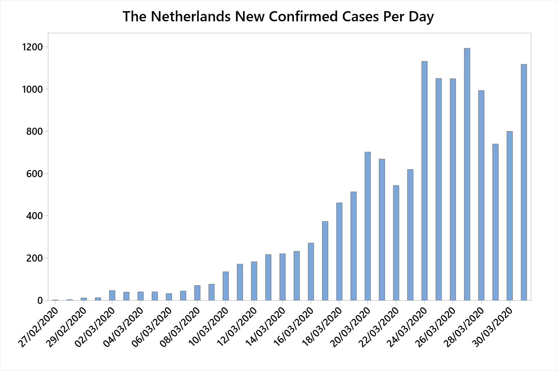
Hi Chris,
Based on your chart, it looks like The Netherlands might have passed its peak for new cases on March 27th, which is the same day as both Italy and Germany. Italy has already started to see a decline in the numbers of daily deaths. We’re still waiting to see that for Germany.
Here’s the model produced by Dr. Murray and his team. Unfortunately, it’s just for the U.S. On the site, you can find notes and FAQs, which are interesting. His model is currently projecting 93,000 U.S. deaths by early August. Although, there are large margins of error (40k – 180k deaths). He’s also looks at hospital beds, ICU beds, and ventilators. You can look at the entire US or choose any of the states. I’m sure his model incorporates the infection rate, mortality rate, and number of susceptible people. Of course, there are large variations in estimates for the infection rate and mortality rate due to various problems with those data that we’ve discussed. Hence, the large uncertainty!
Please track Sweden. They are not forcing quarantine. The China curves look wrong .. I assume they are not reporting accurately. Finally, as I asked earlier…are you able to normalize by numbers tested ?
Hi Mike,
There are questions about China’s data. For now, I’m leaving China in. I don’t see anything that completely sticks out as looking odd.
I answered someone else who asked about adjusting based on testing rates. Instead of retyping, read my other response. In short, the data aren’t available. However, I’ve started to include new daily deaths. Those are more concrete. When COVID19 causes a death, it will be noted and counted.
Jim. As a Physician heavily involved in addressing the Opioid Epidemic in the USA and Canada – Specifically the Accidental Overdose Death Rate (and thank God that is not like a virus which exhibits exponential growth in cases ) , I found your cases per 100,000 extremely illustrative and using it compare against other Epidemics . Especially comparing countries . Deaths per 100,000 is a very useful for us but is confounded by our Testing . Our “Testing ” is post-mortem – after accidental death is diagnosed – then we look at aetiology .
Testing for Substances of Abuse is confounded by the different drugs used as usually cause of death is more than one drug,
Many of the deaths from COVID-19 ( SARS-CoV-II) at a later time could in fact not be due to COVID-19 but better to classify them now as that until “Herd Immunity ” develops .
Regards to all.
Please post graphs of deaths or hospitalizations.
# cases are grossly inaccurate because many countries slowed testing as USA increased. More tests- more cases revealed, but not factually more cases. #Deaths more factually correspond to #cases
Hi Laura,
The increase in confirmed cases is a function of both the virus spreading exponentially plus more testing. I do plan on including more about numbers of deaths. That will probably fit better in my post about coronavirus mortality rates. Coming soon!
Could we do one where instead of starting at N=20, we start at a population infection rate? I.E., start at the point where the # of infections is equal to 0.01% of the population or something
I feel this graph is a little unfair – bigger countries can physically have more outbreaks due to more space in the country and more people, so comparing totals is slightly unfair, even though either way I’m sure the U.S. will have the worst response.
Hi Clio,
I include the per capita rates for cases and deaths in a table to help people assess the impact on each country. The growth in numbers of cases is often represented as doubling time for cases rather than doubling times for per capita cases. I explain that more thoroughly in this comment.
I believe the numbers coming out of China are very unreliable. Including their reports tends to delegitimize the other statistical conclusions.
Hi Jeff, there’s been a lot of chatter about how the reliability of China’s data. I’ve considered removing their data. However, for the time being, I will leave it in. Because all the countries’ data are separated, you can disregard China in the graphs and it doesn’t impact the interpretations for the other countries. So, no, it doesn’t delegitimize the conclusions for the other countries.
Jim the country by country bar charts of daily cases are invaluable and esp nice to have all in one place!! (Daily deaths would be good too,but no worries as Im sure you’re busy enough with updates and responging to everyone). I believe bar charts,linear(logistic?),and log graphs are all important tools. Tying on with what Rick said,yestetday as a matter of fact,I started to use an online CAGR calculator to guage the annualized growth rate(daily growth rate on this case) for various countries from…a beginning(arbitrarily chosen) minimal bar chart line(inflection point) to the assumed peak bar chart line(apex) For i nstance the US is currently running a 15.09%growthrate-12 days,Spain 20.65%-12 days,Italy 12.59%-14 days.May do the same for the downside bars..Do you think this is useful or getting just plain silly?
Hi Charles,
I might add daily deaths, although those would work better in my post about coronavirus mortality rates.
I think figuring out the percentages is fine. They might be informative for comparing countries. But, I really wanted to go inside each country and show the increasing numbers of cases and the volume of cases, which is what impacts healthcare systems. Also, the peaks on the number of cases graphs are much more obvious in showing how lockdowns have worked in various places. Percentages don’t really help with that.
In a more general sense, the decision to go with either raw numbers or percentages depends on the subject area and the goal of the analysis. For these data and for what I wanted to show, the raw count of new cases per day worked better. I also think the cumulative graph with all the countries gets at what the percentages are trying to show. Steeper slopes on the cumulative chart correspond to greater rates of increases. Still in cases per day. But, consider that your percentage for Italy and the United States are just several percentage points different. That doesn’t sound like much. However, compare countries on the cumulative chart and there’s a huge difference. Compare their daily new cases graphs and you can see that Italy has controlled its rate better than the U.S. has to this point.
Percentages might be more useful for projections. If we know that the U.S. has been experience X% growth daily, it helps predict the next day’s value and beyond. However, that wasn’t my goal here. In fact, given the general poor quality data we have, I’ve avoid projections! Additionally, it’s hard to know how far along the curve you are until you start seeing it bend downward!
So, to answer your question, it depends what you want to do with the data!
Jim, could one do linear regression with these data, showing for example the number of cases as the dependent or outcome variable? Predictor variables could be time since patient zero (or patient 20); whether and when social distancing was introduced, population density, percent of population tested, average household size, etc. ?
Assuming we don’t get a vaccine anytime soon, social distancing won’t extinguish the virus, it will only keep it at bay for a while. So as soon as people relax their social distancing , the virus will rapidly spread again—although this would be counterbalanced to some degree by the increasing rate of immunity in the population. And vaccines themselves are not 100% effective either . . . . I hate to say it but this virus might be afflicting us humans for quite some time. And to think it started from probably ONE BAT.
If biological samples from people are being taken now, for example from blood donations or nasal swabs from a cross-sectional sample of people, they can be tested later for the virus. Then we can estimate how many asymptomatic cases there were, and when.
Jim,
Thanks for the detailed analysis. It was a great read particularly since I recently took Stats. I didn’t have a chance to read through all the comments but do you have or will you be showing any data in regards to the total amount of testing being done. Essentially showing the number of negative results as well as the positive? Of course the number of tests administered will ultimately affect the number of both positive and negative results. Just curious and thanks again for the information.
Hi Nathan, unfortunately I don’t have access, or at least haven’t found, publicly available records of the number of tests administered over time. It’s generally accepted that there has been severe under-testing in some countries and that the number of actual infections is far greater than the number of confirmed cases. The increase in confirmed cases is both a function of the exponential spread of the virus plus increased testing.
Graphing the number of new cases each day hides the rate of increase. My simple rated calculation is number of new cases since yesterday divided by the number of cases yesterday. I think that this is far more important than the number of new cases. For example, if there were 1,000 new cases each day, that would mean that the rate of increase was dropping, and that would be very good news. If there were 1,000 yesterday and 1,000 more new cases today, that would be a 100% increase which indicate that the cases are doubling every day. If there were 50,000 cases yesterday, and 1,000 new ones today, that would be a 2% increase, and the same number, 1,000 new cases, would mean something VERY DIFFERENT!!! It would double after about 35 days…
Hi Rick,
There are always pros and cons for using absolute counts versus percentages. No, using the number of new cases doesn’t hide anything. It’s just a different way of present the results. I chose to use number of cases because we’re talking about people. How many new people are newly confirmed each day? Additionally, each country has a capacity for handling a certain number of patients. That capacity is represented by numbers of cases. Imagine that the number of new confirmed cases remained constant at a high volume. You’re correct that the rate is decreasing but the system still feels that large number of new patients per day, On the graphs, you can easily see whether the daily number of of new cases is increasing, decreasing, or remains the same. The number of cases captures the volume that the health care system experiences.
You’re correct that you can also graph the percentage change. However, I would argue that it makes interpretation more difficult in this particular case. In Italy’s graph below, I calculate percentages using the method you describe. You get some real large percentages early on. That’s a distortion because you’re increasing from 17 to 42 to 93. You get huge increases percentage-wise but the true increase on the burden to the system is small. Later on in the graph, you have smaller percentage increases but they’re associated with much larger numbers of new patients. You also can’t see when the peak occurs on the graph below. Around the peak, you don’t have high percentage increases but there are large increases in the raw numbers of patients, which is what affects the health care system. Obviously percentages can be helpful in some contexts, but I don’t think it helps understanding here because you get the large percentages with small numbers of cases and smaller percentages with larger numbers of cases. The percentages are not capturing the volume of patients that the health care system needs to treat.
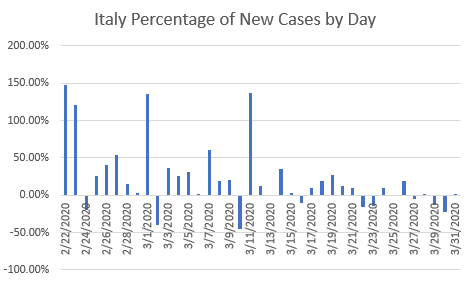
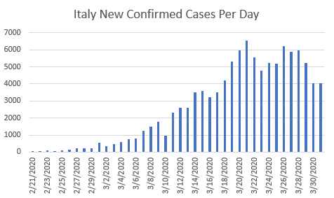
Jim,
I’d like to see an additional visual that could provide a reality check about the timing of ‘restarting the economy.’ Basically, my interest is an overlay of line charts that does not adjust the start dates, but rather puts everything on the calendar so you can see the sequences as well as the magnitudes. The reason I think this would be interesting is twofold. First, in charts I’ve seen for the 1918 pandemic, there were double peaks just about everywhere. This may have been just because of a mutation in that strain (which is known to have happened), but if you look city by city in the U.S., those with stronger lockdowns had flatter curves, but still had double peaks. Second, and tying in with the above, I could imagine that a second peak is triggered by relaxing restrictions too early. E.g., in this article (https://www.washingtonpost.com/graphics/2020/national/coronavirus-us-cases-deaths/) I was able to look at the chart for each state, and you can see that WA and OR both have pretty flat curves. Suppose they relax, and suddenly have the undiagnosed people out and about again, or people from states whose curve began later go to the beaches. The long and the short of it seems to be that those who locked down early would probably need to remain in lock down longer, really until the last of the late peaks has dissipated.
And, that would therefore provide an indicator of when we can all come on back out of our burrows.
Thanks for your great info.
Jeff
Hi Jeff,
You’re right that the different types of graphs will answer different questions. I might put together about the timing of the different states. There’s clearly a set of states that started early and others that started later. I also agree we most likely will have to wait until all the peaks dissipated.
However, I’d also assume that after all the peaks dissipated and we relaxed the social distancing, that cases would reappear. After all, we started from literally zero cases in the U.S. and in just a matter of months have gotten up to over 200,000! Social distancing can control the rate of new cases but it won’t take cases down to zero–so there would be an existing seed population for new infections. That’s not to say we can stay locked down until a vaccine is developed, but it does suggest that there will be waves of cases and lockdowns. Eventually either a vaccine will be created and distributed or herd immunity will kick in.
I haven’t researched the 1918 pandemic much but it was a seasonal flu and a suspect that at least a part of the reason for the multiple peaks is the seasonal nature. That it came back for a second round in the Fall. The same thing might happen with COVID19.
Please normalize by # tested and take a look at California..important I think to considering a normalized rate of infection relative to # tested by region…absolute numbers by day growth are a bit misleading without considering the accelerated testing. California appears to be flattening.
Correction regarding Boris Johnson only taking this seriously after contracting covid-19 himself. The measures he and the UK government put in place began in advance of any diagnosis of the PM catching the virus.
Thanks, I updated that information.
Hi Jim, thank you for the very insightful analysis and comments. Two requests, 1) I think the numbers of China ex-Hubei are super interesting with extremely low death rates showing the benefits of enacting restrictions very early on, and 2) can you please include Canada in your analysis for your neighbors north of the border? Thank you!
Hi Jim. Italy’s sequence of peak infection days began IMO on Mar 19 when they had 41k cases and lasted 10 days thru Mar 29.(bar chart info from worldometer).Our peak days started Mar 26 when we had 85k casss(again just my observation) so should we expect to have minimally 2.5 times our current cases(as they do now)at the end of the 10 days or… possibly a longer period and proportionately more cases given a. Our infection rate per 100k is .29 of theirs b. We have 5.2 times their population. c. We are 9 days behind their curve. and d. By all accounts they are exercising way more stringent “control measures” than us??!
Hi Charles,
I’m going to be adding in new graphs of the new confirmed cases by day, which gets to what you’re talking about. Italy looks to have passed their peak already. We’re still building up to ours. I’ve looked at the results of profession epidemiological models and there are huge margins of errors both with the number of deaths and when the peak will occur in the United States. Estimates range from 80,000 – 240,000 deaths. And estimates for the peak range from occurring in one week to occurring in three weeks. The problem is that we just don’t have great data. There’s a huge shortage of testing even now. Plus, there is no consistent protocol across the states. Some of the better case estimates assume that all the states come on board with stay at home orders. However, that’s uncertain. And, if it does happen, the timing is crucial. Just so many uncertainties. But, it looks like it be really bad even in the best case scenarios.
Thanks for your recent insightful blogs on the coronavirus outbreak, Jim! I always read your blogs with great interest. I do have one remark on the exponential growth of the infections, admission of patients and deaths. Any exponential growth in the real world (e.g. a virus outbreak) essentially is just the start of a logistic curve, as shown by the curve of China in the first figure of this blog. One could use a three-parameter logistic growth function to follow the virus outbreak and gain more insight on the expected maximum number of cases, the growth factor and the inflection point.
Due to the insufficient testing capacity in The Netherlands, the death cases and admission of COVID-19 patients are better indicators of the course of the outbreak. Below are the curve fits of these indicators in The Netherlands since N=20 (updated with cases up to March 27).
From the curve fits it seems that the measures taken by the Government are effective in that our country is past the inflection point at which the increase of new cases is declining. What is your expert opinion?
It would be great to read your take on using nonlinear regression on this vital topic in a future blog!
Hi Chris,
Thanks so much for posting your graphs here along with the background. I saw an interview with Chris Murray of the University of Washington who has done some complex modeling for the United States. He said that the number of deaths is the best metric to model in terms of predictions. It’s a fairly concrete thing. Whereas with the number of confirmed cases you get into the whole thing about severe undertesting that probably varies by location as well as selection bias for testing those with more severe symptoms. That matches what you say about a better fit for deaths.
The difficulty with fitting a log curve is that, while you can get a very good fit (as you have), it’s hard to down how far along the curve you are. Until you start seeing a downturn, the curve won’t predict a downturn. If the algorithms sees only an increasing number of cases or deaths, it’ll have no information to know when things will change and just predict an ever steepening curve. Dr. Murray’s model presumably factors in the R0 (number of people that one person will infect) among other factors to predict when the downturn will occur.
From the last point on each graph, you can sort of see a very flattening. The last portion of the curve seems to be a more linear, consistent number of new cases per day. Can you create a daily new cases graph for The Netherlands like I did for the other countries? I wonder what that looks like?
We need to be careful when comparing these graphs not to look at them as a judgement of the performance of their respective countries’ governmental mitigation policies. Larger countries with higher number of foreign visitors will have a much higher number of patient 0s. I’m sure North Korea may look comparably good. A good country comparison metric would be one normalized for population density in the densest area of each country were say 10% live coupled with the number of foreign visitors to that area each year. What I am getting at is that some countries mitigation policies deceptively look better until you see that they had an advantage from the beginning, such as totalitarian control, low number of visitors, previous major viral outbreaks, lower population density, climate, etc. I suspect but I cannot confirm that the graphs as recently published are designed to make the current US administration look incompetent, but one needs to realize if the US states were each looked at as different countries which they kind of are in respect to each state’s governor and each city’s mayor, it seem logical that the “lock down” policies should have been enforced earlier in the densest urban metropolitan areas especially those with high public transit usage.
Hi Brian,
First off, this is not a political blog. I’m not interested in making countries look good or bad. I’m interested in the data and linking them to the different policies that countries have had. What has worked? How effective? How long did it take to work?
All the factors you point out are relevant. Much of the more in-depth analysis will have to occur after the dust settles and people can collect better data, consider all the different, and reconstruct what happened. Right now they don’t even fully understand the full nature of the virus itself! For now, we can take a look at the data we have to get a picture of what is happening. The good news is that several countries have gotten the growth of new cases per day under control. Those cases aren’t increasing exponentially anymore. That was the goal of the social distancing protocols and they seem to be working. I’m adding graphs to this post to better illustrate that. That was one thing I was particularly curious about when I wrote this article. Will we be able so see the result of social distancing. We can. And, that’s great news!
To address several of the issues you mention, please note that some of the Asian countries have much higher density and greater usage of public transit than say the United States. As for previous viral outbreaks, I mention in this article how the experience in some countries have prepared them for the coronavirus. They had policies and procedures ready to go. I also mentioned how China used authoritarian protocols that wouldn’t be acceptable elsewhere.
One lesson from all of this is that we can use a piecemeal approach. It might seem to make sense to lock down certain areas first and not other. However, that simply promotes movement from the lockdown area to outlaying areas, which simply spreads the disease more.
Great information, and fascinating checking in every day or so to see how things have changed.
I’m not a statistician by any stretch, but aren’t these graphs relevant to the number of tests actually being carried out? If a country are testing more people quicker than another wouldn’t their line be steeper anyway?
eg Germany and UK similar countries but Germany are testing 500,000 people per week vs UK 50,000 tests per week.
Hi Jarrod,
Yes, you bet that’s true. It’s a big problem. We don’t have a great idea of how many infections there are. However, it’s the best data that we have at the moment. These confirmed cases will tend to be the more severe cases while those with milder symptoms will either not seek testing or be turned away. I write more about that in my post about coronavirus mortality rates.
However, there are countries who have increased their testing and yet their numbers of new cases have stabilized. I’ll be adding graphs that illustrate that show a leveling off. So, we can still obtain valuable insights from these imperfect data.
Thank you so much for all this information as I’m also interested in the numbers and trends happening with this pandemic. I have been doing my own graphs as well but this is just amazing!!
Thanks, Hannah! It’s great that you’re taking your own look at the data!
Thanks Jim, this is worth a semester in college. Question: If COVD-19 was a new strain requiring a new vaccine, how could any country be prepared for an initial infection? The data presented by Johns Hopkins, and here, is for the COVD-19 virus. Is it proper to apply this statistics to the next unidentified virus? Having a stockpile of PPE’s seems reasonable now, but how does a nation stockpile a vaccine for an, as yet, undetected virus? What statistical info here can be reliably overlaid over the next brand new virus? Please know that I am not throwing stones as I consider your insights valuable.
Hi Mark,
I completely understand your questions. And, there are so many unknowns that answers to some are probably impossible at this point. There are signs that it is a seasonal virus. That it does better in cooler temperatures than warmer temperatures. But, I don’t believe that has been firmly established yet. There are also indications that it doesn’t mutate particularly quickly. That’s a good sign for vaccinations. If it doesn’t mutate, then a single vaccination might be enough. However, again, that hasn’t been firmly established as far as I know.
However, if it is seasonal and it mutates, then it becomes more like the flu in terms of it coming back year after year and needing new vaccinations each year. Another consideration is that if coronavirus mutates, then its contagiousness and mortaility rates might well also change with each strain. That’s what happens with the flu. Consequently, it’s not entirely valid to base projections for potential future strains on using the current strain of coronavirus without use a lot of caveats! And, a reminder, half the cases of what we call “the common cold” are caused by various strains of the coronavirus (not including COVID19), which shows how much they can vary!
Best case scenario is that it doesn’t mutate and that a vaccine puts it out of commission.
It’s hard to project with so many unknowns. However, I’d agree that it seem wise to stockpile PPEs and ventilators just in case.
Jim:
This is the graph the world needs to see.
The graphs published by the news media all use a logarithmic scale, distorting the vast differences in outcomes between countries. Thank you so much for creating and sharing this critical information in a user-friendly form.
The Guardian just published a devastating article on the differences between the South Korean and U.S. outcomes. I altered your graph to show just those two countries’ results. I had to fudge a few lines.
An ‘official’ Jim Frost of this two-country graph would also be useful, especially in conjunction with that article. Perhaps you could create and publish one, along with the Guardian article link?
https://www.theguardian.com/us-news/2020/mar/28/trump-coronavirus-politics-us-health-disaster
Thanks again for the superb work.
Hi PJ,
I’ve edited your post so your graph appears in it rather than being a link. I’ll read the Guardian story soon. Thanks!
Jim I use a technique we use as environmental engineers to evaluate whether or not pollution data in the environment is following an increasing or decreasing trend. I used it to evaluate corona virus data . To look at short term trend we calculate a 3 day rolling average and compare that to the value for the third day. Based on this you calculate a growth factor. If the daily single average/3 day rolling average is > 1.20 you have a strong increasing trend. Goal is to get that factor below 1.0. I picked 1.20 out of the air but it seems to correlate to exponential growth.
Any statistical validity in this approach?
regards
Frank
Hi Jim,
Thank you for this work. I appreciate the perspective it offers. I wonder if you would add a graph that shows infections per capita? Is that a better measure for infections in a country? Why or why not?
Steve Loy
Billings,MT
Hi Steve,
I’ve addressed this question elsewhere in the comments. So, instead of retyping, please read my response.
That’s not to say that per capita is not a useful measure (quite the opposite) but it serves a different purpose. Down the road I might well publish a different post that looks at it from that angle.
I found one graph that shows growth with a fixed doubling time. That’s really not what I was interested in. That graph indicates that we never recover. I’d like to see a graph that actually shows the current growth/decline. How flat is the curve based a model from China’s recovery.
If anyone knows where to find the stats that exclude China I’d very much appreciate the link to the website!
Hi Jaysun,
I present the statistics by country. Consequently, all countries other than China do not include China!
If you want to filter the data yourself, click the link I provide below the chart in this post for the Johns Hopkins data and you can filter it any way you like.
Hi Jim
I realize we can’t all jump on the bandwagon and request that you add more and more countries – but I am still going to try! I am from South Africa and our 21 day total lock down started yesterday. I would love to see South Africa represented on your graphs to get an idea of the efficacy of the lock down in relation to other countries. Will be following your very informative blog whether we are represented or not! Thanks.
Hi Liesel,
I will add South Africa in the very near future. Unfortunately, it looks like the coronavirus might be starting to increase in the southern hemisphere as it approaches Fall. I plan to add several countries in the southern hemisphere and keep an eye on them!
Stay healthy!
Just noticed worldometer showing 104021 case count at 9:00pm cst but I projected 108k to as High as 115k(at 11:am) 10 hrs earlier. Then noticed that New Jersey and a host of other populous states’ numbers hadn’t changed since 11:00 am cst??? What’s up with that? Also as I projected at 11:00am Texas and Cali saw moderate declines in day over day new cases while Georgia cases doubled and New York up 21.2 pct,less than my 37pct projection …I think New York and Cali data can be used as worst case best case ‘canaries in a coal mine’ going forward
Hi Charles, I’ve noticed similar things. The data comes from all over the world, gets entered into different systems, and then collated and added to the master data set. It must be quite a process! I’m sure that glitches and delays are not unusual! It appears like the lockdowns might be having an effect.
Hi Jim..any thoughts on the rate of change of the percent change in us cases day over day? I noticed roughly 12pct point increases over the previous day pct increase since 3-23. But adding 12 pct to yesterday 32.71pct gives a 44 pct expected increase for tomorrow. But as of 3pm cst we r on track for only 106k to 110k total cases which would about match the current 32.71 pct plus/minus a few pcts.Btw California seems it may have less cases tomorrow than today….possibly Texas too.
Hi Charles,
What you’re talking about is starting to get into the realm of log scaling. Charts that use log scaling display the rate of change. If you have a constant rate of change (i.e., 44%), then you get a flat line on the chart. However, graphing the data using a linear scale, it displays the change in raw numbers. Suppose you have a fixed 44 percent increase the remains constant from day to day. That fixed rate graphs as a straight line on a log scale. However, if that rate remains constant, then each day it represent a larger increase in raw numbers. Hence, the increasing slope on a linear scale.
I use linear scales in this post to emphasize the dramatic nature of exponential growth. That’s not a concept that is easy for some to picture. I think these charts make the consequences of exponential growth more obvious. However, analysts will often use log scales when they want to focus on analyzing the rate of change itself. And, that’s what you’re talking about with percentage increase each day. In one of my posts, I explain log-log plots, which use log scales on both axes. For the coronavirus data, you’d only use it for the Y-axis.
I’ve considered adding some log charts to this post. Particularly, I think it would help show how Italy has slowed down. That’s not completely obvious on the linear scale because it’s still quite steep. But, a chart that uses log scaling should emphasize that the rate of increase itself has slowed down. Same for what you’re talking about for the state data–which sounds like good news. I haven’t focused as much on the state data but will take a look when I get a chance!
Do you have any projection graphs? How flat are the curves for some states compared to others?
Hi Dusan, I did post a graph with some curves for U.S. states in the comments section for this post. Scroll down a bit to find them.
Could you create a graph that takes the population sizes of the various countries into account? Comparing absolute numbers of cases in the US and Italy, for example, seems to give a misleading picture
Hi Phil,
This is a bit more complicated than it might seem at first glance. The thing to keep in mind is that the raw case numbers are more closely associated with growth patterns while the per capita numbers are more closely associated with the impact that the cases will have on a country.
For the raw numbers, think of it this way. Suppose that one country has a population of 1,000 and the other has 1,000,000. Each country has one case to start. Now, suppose the number of cases doubles at each step. So, you get a sequence of [2, 4, 8, 16, 32, 64, etc.] in each country. That sequence is determine by the characteristics of the virus itself. For example, given the contagiousness of the virus, you might find that one person infects two people on average. It makes no sense to divide the initial case and subsequent cases by 1,000 and 1,000,000 because it’s the raw number of people who have been infected that determines the spread. Of course, in the smaller country, there is a smaller upper-limit on how many people can get the virus.
That’s an oversimplification of course. Many other factors such as population density and geography play a role.
In terms, of impact on a country, per capita numbers do help there. I do that for U.S. states in my post about coronavirus and medical hotspots. In a future update to this post, I’ll add the per capita numbers by country.
THANKS JIM…YOU ROCK MAN!!!!!’
You bet! And, thanks!
Anybody know where to find state by state daily infections and deaths numbers for the past 10 days os so???? All I can find is current numbers or yesterday vs today on worldometer. They need to rush the med. equipment to the several exploding metropopoli ie New Jersey…and hope the rest of us can hold out(delay the INFLECTION POINT) until they are stabilized and can return the favor….cause I don’t know if we can mfr. the machines,etc fast enough…or fly some in from China and other “post epidemic” countries
Hi Charles,
I look at states in my post about coronavirus cases and hospital beds in a per capita manner but not over time. In that post, I noted Louisiana well before it became nationally known. Additionally, the Johns Hopkins source that I link to in this post provides case information at the state level, and recently started with county level information.
Below is a test chart I made thinking about a U.S. States blog post–look for that down the road. The chart covers data from March 10 through March 22. I included states that seem to have started the exponential growth phase. States can bubble along with few cases and then suddenly take off. In other words, a state can go from looking good with just a few cases and then suddenly the cases take off. I didn’t include NY because that would throw the scaling off and make the other states hard to distinguish.
I was tracking NY plus N.J. plus Wash plus Cali as a percent of u.s. total for the last week or so. It’s gone from low 60s to mid 60s and now down to 57.xx and dropping indicates a broadening of the “fire’s” base. If we negate those 4 states because they were early onslaught hotspots…then I think the rate of spread in the other 46 states becomes a pure function of some weighted combination of a states total population and population density.this could explain why Texas is so much lower than many other smaller and less populated states. Louisiana seems to be disproportionate for some reason,though. The only ways to put out a forest fire are 1.Dump retardants on it…ie get vaccine so we are virus proof.. or 2. Remove the fuel source(ie thin out/lean out the vegetation) by social distancing so the virus is essentially starved out.
Hi Charles, I really like the forest fire analogy!
Hi Jim,
Thank you for your work. I apologize in advance for this morbid question, but is there any way to compare rates of infection to deaths on the same (or similar style) graph? It would be interesting to see how deaths vary by country – sort of a spread between the number of infected vs. number of fatalities – although I’m not sure if it’s possible to base that on quality of healthcare systems, etc. At some point, when healthcare facilities become exhausted, I would imagine that the death curve would steepen. Thanks.
Hi Jeff, that’s a great idea for a future post! I will aim to get one up in the near future!
Thank you so much, wonderful information. Dumb question from someone who never took statistics: Are the coronavirus curves technically bell curves? And could you compute the total number of cases from the area under the curve? Thank you.
Fantastic! I look forward to seeing that even if it doesn’t have a completely thorough data set either. I think it would still be valuable to look at. Thank you!
Hi can you please add india in your country chart. Your data presentation is rather easy to understand and being from India I would like to see how the lockdown imposed here is affecting the curve
Hello Dr. Kaur,
I’ve added India to the chart. Let’s hope it stays in control there!
The graph says the data were last updated March 22, but the narrative description indicates more recent updates. I check your chart daily because I find it so helpful… thanks!
Hi Linda,
Thanks for catching that! I did update the chart but forgot to update that text! I fixed it. I typically update the chart and text after midnight Eastern time using the previous day’s counts.
Thank you so much Jim and to all for the discussion/Q&A. My question is how might you consider the rate of growth and the level of testing in each country over time? My general understanding without going back to the exact data is that S.Korea had/has dramatically more testing than the US for example. This leads me to assume the error bars around that curve are much tighter than US. And, is it safe to assume that the US data is confirmed cases and that with testing the number would go up much more than it would come down? And from that, is there anything beyond social isolation and testing that can change the slope of the curve in the short-term?
Thanks again,
Dave
Hi Dave,
It’s definitely correct to say that there are many problems with these data! They’re definitely “fuzzy.”
I’m sure that the various countries have tested different proportions of their populations. Undoubtedly, some of the increases in the US are due to increases in testing. Although, infections are still increasing as well. It’s also true the new cases represent infections that occurred several weeks ago. In the US, and it might vary by country, individuals are only tested when they present symptoms due to a shortage of tests. Symptoms seem to occur 5-7 days after infection. Furthermore, the processing time for these tests are another 5 days or so. So, a case is confirmed about 10-14 days after the infection occurred. That’s a key reason why officials say that it’ll take around two weeks for the effects of isolation to show up in the curves.
So, these data are imperfect but they’re the best look that we have. And, it’s true that some countries have much more testing relative to the size of their populations, such as South Korea. And they’ve largely flattened out their curve by using testing, isolation, quarantines, contact tracing, etc. Given the current “quality” of the data, it’s probably not feasible to do more complex analyses at this point. That’ll probably have to wait until later when they can reconstruct what was happening. They’ll also need to perform random samples of testing to get an idea of its true prevalence in the various countries. The samples right now are not random.
Given the lack of effective medication, vaccination, and natural immunity, there’s not much else that can be done other than isolate ourselves to slow down the rate of infection. However, I believe these data show that the virus is spreading exponentially, we an assume there are more cases than confirmed, and that mitigation efforts have been successful in various countries. Some were on the ball immediately while others got a slower start and started up the exponential curve before flattening them out. Other countries are still riding up those exponential curves.
Hi Jim!
This is very interesting to look at! Italy’s “bump” I found curious. It appears as though the graph continues on the pretty much the same path shortly afterwards. Was the bump then likely a result of fewer people going to the doctor for a few days and getting diagnosed? It certainly was too soon for results of the quarantine yet. I’m relieved to hear that they are starting to flatten a little.
I also found the comparison between some of the asian countries and their quarantine measures/results vs.US, China and Italy’s measure/results, to be noteworthy.
I’d be extremely interested to see the curve with deaths if you’d be interested in making that? I think that discovered cases is heavy influenced by availability/use protocols of testing. I’m wondering if part of the dramatic upswing in the US’s line, could have been from beginning/increased testing? Currently, I feel that we KNOW how many people have died, but we really don’t have reliable info on how many have been infected. We are being told that some likely have already recovered from it without even knowing they ever had it in the first place! We do know deaths though, so that is what I like to look for, but haven’t really seen much out there in visuals for that. I think this graph and one like that together would give us a pretty good picture. Interested? Thank you for sharing this.
Hi Becky!
That bump is curious. It could just be a data fluke. It occurred right around when Italy started its lockdown and perhaps represents disruptions in a system that’s changing states (from free movement to locked down). Impossible to say right now. And it is definitely not the lockdown slowing down the infection rate. As you say, it’s too early for that.
I’ll take a look at the curves for deaths. One note on those data. They are a subset of the confirmed cases. In other words, if someone dies from coronavirus but is not a confirmed case, they won’t be represented. In other words, someone might die from pneumonia like symptoms, the doctors might even suspect coronavirus, but if they’re not confirmed by testing, they won’t be counted as a coronavirus fatality.
Hey Mary Beth google:u.s. state corona virus curves show many could be close behind New York….I found last night….so about half the states are above or in line with my and the others,though early,below ny. Interesting if the numbers are accurate that Cali. deviates signigantly from ny esp given its ?40million residents…btw I expect us will overtake Italy between Thur fri and China by end of weekend…..sad
Thank you Jim. I’ve been looking for the data graphed like this. It’s the most imformative information I’ve seen to understand how serious the situation is because of lack of early action.
Can you do a graph like this for the states?
Thanks so much!
Hi Mary Beth,
I’ve started look at curves for states. In the meantime, to get a sense of the impact on each state, read my post that looks at the coronavirus by state in terms of hospital bed. I look at the per capita infection rate by state and compare them to the per capita number of hospital beds by state. Not exactly what you’re asking but it’s at the state level. California is interesting because they have a large number of total cases but they fall right at the median infection rate. They have many cases but they also have a very large population.
Hi Jim, First, Thank you for your time allocation and labor,
My discussion point is slightly different from your content.
Some of the agencies report that the death rate is calculated via ” total deaths divided by total virus cases”.
Rather, from my point of view it should be “totals deaths divided by cases which had an outcome(Deaths or Recovered), active cases should be kept out.
What is your opinion about this situation?
Regards.
Jim. As an avid math nerd your graphs and analysis r what I been lookin for these past several days.worlometer is good to esp the log curves and you r right Italy is bending.canu add Spain Germany France Iran and New York so we can gauge the top nations trends.also develop a typical y to the x parabolic?hyperbolic curve that predicts expected propagation from case 1 to case z as a function of time
Hi Charles,
I’ve definitely thought about adding additional countries for comparison. I’ll see about adding those in!
I’ve resisted doing more complex analyses because the data quality is rather poor. They give us a glimpse of what is happening but it’s not crystal clear. I address that in other comments in this post. For instance, China and South Korea both had started up their exponential curves but then flattened them out. However, they’ve used very different timings and protocols than other countries that have started up their curves. So, there is no typical propagation. Also the population densities, geographic characteristics, and medical and other resources varies greatly between countries. I think there will be much more in-depth analyses on this issue, but it’s hard to do with the incomplete data that we have right now. However, we can still draw some conclusions. For example, from Italy’s lockdown and the slow impact on its curve, we can assume that it’ll be similar for the United States and probably the other European countries.
Actually I have the same question. Wouldn’t total population still affect the growth rate though? I would imagine the rate of growth in an urban setting would be much higher in the villages.
can we convert this into a kind of hypothesis testing and ask a question that it will flatten out by mid Apr20, is it valid or not, can you help me out ??
Hi Babu,
Unfortunately, not even the experts know what to expect in terms of timing and how much of an effect these measures will have. We’re in uncharted territory. It’s almost like an experiment on a grand scale. Our picture is also incomplete and fuzzy at this point. The numbers are confirmed cases but we don’t know how many unknown cases are out there. It’ll take much study after the fact to reconstruct what has happened. It’s hard to come up with a hypothesis test given such poor quality data. I think eventually we’ll be able to look back and compare the curve of actual cases to the curve of cases we’d expect with unbounded exponential growth to get a sense of the effectiveness of the social distancing measures. But, there’s no way to look forward and predict what will happen right now. We can plot out the exponential growth curves and then hope that the social countermeasures will make the reality less dire!
How would these curves look if the values were per capita, rather than number of cases?
Still not there (https://tom.alby.de/using-r-to-plot-corona-data/, scroll down to 3rd plot)
Yes, that explains the difference. Thank you! I was wondering whether you could also disclose your EDA next time so we can see exactly what you were doing. Again, thank you for the inspiration.
Great analysis, but I cannot reproduce the US graph. I have created a R notebook with the same data (see https://tom.alby.de/analysis/corona.html, scroll down to the 2nd graph at the bottom), my code and two graphs. Obviously, I wanted to see the data for my home country so I have included different countries except for China, Italy, and the US. Anyway, thanks for inspiring me 🙂
Hi Tom,
Great graph! I’m not sure why it would be different. For the US, I did exclude the passengers on the cruise ship, which made a difference. Perhaps it’s that? It’s great seeing other countries. Unfortunately, they’re all shooting up so quickly!
Really this is a great work ✨?
Thank you very much for you.
you missed iran , because iran is 2nd most effected country. So in your data iran has not been included , how you can say this result is reliable ..
Hi Rizwan,
It certainly was not my intention to downplay the impact coronavirus has had on Iran. As I write this, Iran has the 3rd most number of confirmed cases at 16,169 and almost 1,000 deaths. My heart goes out to the people of Iran and all those affected.
To emphasize how the actions of different countries affected the outcome, I had to choose several countries where I had a good amount of information about their handling of the coronavirus over time. Unfortunately, I didn’t have much information about Iran’s actions. The analysis isn’t meant to portray the entirety of the coronavirus in the world but rather highlight the different actions of a few countries and showing how that affects their outcomes–both the good and bad.
I hope you and you’re loved ones are doing well. These are difficult times for all and unfortunately Iran has a more difficult burden than most countries.
I wish you good health!
Jim
You mixed up Taiwan with Thailand multiple times in your write-up. It’s Taiwan, not Thailand…they are obviously different countries…
D’oh. Sorry! I fixed that. I was working on this at 4AM!
I have limited data but S. Korea and Italy have tested large numbers of both symptomatic and asymptomatic people.
I have a bar chart that compares both countries but I could not upload it in the comment field.
My only point is that the US decision to test symptomatic people will not find all the carriers.
Very well written article, Jim! Hopefully, all the curves flatten out sooner.
Am I just missing the link to your data source?
Hi Julian, I’ve added a link to the data under the chart in the article.
Response to Stan:
Hi Stan – you observation looks interesting. Universal testing, testing of symptomatic cases, limited testing (in some developing countries) are important variable to look at. If a country not doing enough test, then it would be not appropriate to assume that the country has not got a spread.
Jim- Is there data on the country about number of test done and if test is universal, only symptomatic, number of testing centers and so on. I hear many countries (especially developing countries) have limited testing facility (only in capital city). Instead of not testing enough and use of isolation strategies, the country rather put on international travel restriction and social distancing which would have enormous impact on the society and economy.
Hi,
I agree, it seems like if a country can’t do the test, it’s best if they assume coronavirus is present in their population and act accordingly. However, it is a very difficult position to be in economically speaking.
Source of data?
Hi, I’ve add that below the chart in this article.
Hi Jim,
It is very powerful presentation and analysis of Corona Virus situation. Idea of looking at data from a point of time and onward is very much an epidemiological investigation.
Since the countries have different number of cases, having same scale makes south Korea and Japan invisible. I would suggest that we have separate line graph for each of seven countries with appropriate scale that would help know if spread is continuing or started flattening or declining and about when in each of the country clearly. These seven charts can be put in seven different places of a canvas. As data shows the spread in US and Italy is still on.
One other piece of data that could help know more about the spread is to know that breadth of spread at sub national level. Know number of sub national areas with infection would help know if it is spreading far in a country and if a country is doing enough and responding timely.
By the way is the data you have is publicly available? I would be interested with explore it.
What do charts look like if graphed as percent of population rather than raw numbers? How can you really draw conclusions since, of course, numbers and growth in china and u.s. would look so large…relatively huge populations in comparison….
Hi Christine, that’s a great question. It’s important to keep in mind the difference between growth rates and total number of cases. These charts show the growth rate, which is more related to population density. How many people are close to an infected person? The maximum number of cases possible is connected to the population size.
Think of it this way. Imagine a simple doubling sequence. You start with a single infected person, then double at each step: 1, 2, 4, 8, 16, etc. You can have that same sequence occurring in each country regardless of its population. Of course, the sequence can only go up to the maximum number of people in the country. In the graph, you can see that the U.S. is at a virtually the identical spot as China in its progression along the curve even though China has a much larger population.
Of course, that’s a simplification. There are a number of other issues occurring. It would be interesting to look at growth rates while factoring in population density. Also, these data count confirmed cases only. Countries have differing levels of testing. Those with less testing will under-report the true number of cases by a larger degree. The United States has a very low testing rate while South Korea has a very high testing rate.
In the end, this simple look isn’t perfect but it does give a good idea of how countries compare. Further analysis would certainly be able to factor in other considerations.
And, that’s not to say that it wouldn’t be interesting to look at the percentage of the total population to get an idea of the impact on a country. Perhaps a future analysis! For this post, I wanted to focus on the growth rate of confirmed cases.
Thanks, Jim! Math teacher here — I’ll use this with my class. Great for class discussion!
Hi Jim, really nice clear graph. What was the source for this data? I’m interested in building on this and adding extra countries.
Hi, I’ve included the source for the data under graph in the article. The data source includes all countries with cases. I whittled it down to seven to clarify the factors at play!
Thank you so much , Jim!!
South Korea and Italy had virus outbreaks before the virus came to the United States. South Korea, employed universal testing stations for everyone. Italy only tested symptomatic people. The bar graph shows the test results for both countries by age. Many more 20-29 year-olds were infected in South Korea without showing symptoms.
(I could not insert the bar graph here.)
Without testing and appropriate followup, young infected and asymptotic people may be virus carriers, infecting many they contact, creating more virus carriers and more vulnerable older subpopulations.
The U.S. testing scheme does not address this possible scenario because it is directed to testing only symptomatic people for lack of test kits. Younger infected people without symptoms, without testing, and not isolated, may infect many more.
Is the x-axis weeks?
Days since 20 cases, except for China.
Thanks. A great analysis. Need again in 2-3 weeks.
Jim, when we talk about flattening the curve, does it change the overall number of cases projected or just spread them out over a longer time? I have seen on all the graphs about flattening the curve that the top of the flatter curve is our health care system capacity and for me that raises the raises the question of what would happen if we BOTH flattened the curve AND raised capacity. Do you have any way to model that. Please know that I recognize that since social distancing is what has been chosen in the US, we all need to be in that together but I’m also troubled by the idea that the choice is about limited resources because the effects of social distancing on the overall economy. What if while implementing social distancing, we also put resources into creating mobile hospitals, reallocating beds and respirators within hospitals, and quarantine of people with symptoms? Statistically speaking, is there a way to flatten the curve and also reduce the area under the curve?
Thank you very much Jim !! Very good job !!
I live in Athens, Greece and we have 352 cases at present.
The virus got in from abroad, as there was free entry from abroad up to now, while on the other hand they had put limitations in public meetings etc !! Controversial policies indeed !!
It would be of interest if you find data for Greece too !
I read your posts regularly.
I will communicate this article to my friends.
Best regards
Elias
Prof., you are great in using simple statistical tool, the graph, to explain a very difficult World Medical Question. It is my belief that every government in the world today and in future will start to give priority to scientific research.
Regards.